2025-03-26: Gates of Heaven
GATES OF HEAVEN | How NOT to go through them
Using your free will to keep doing God’s work
Listen to an audio of this blog post below and / or continue on to read.
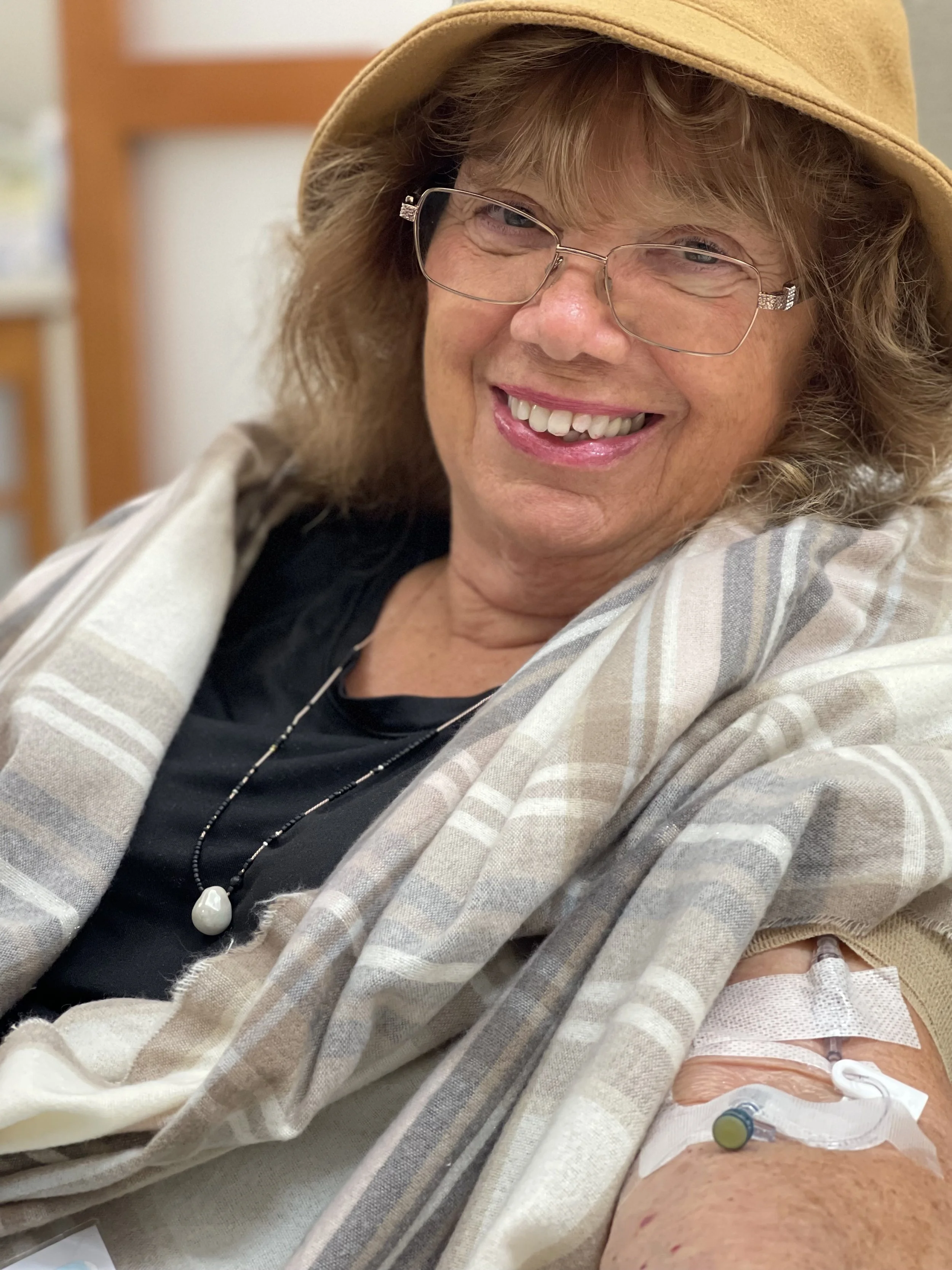
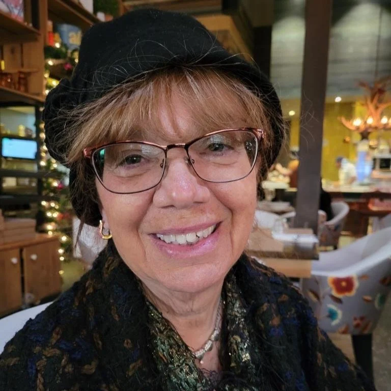
The fires in Los Angeles, CA began on the same day my mother started immunosuppressive therapy for her Chronic Lymphocytic Leukemia, a slow growing blood cancer. Getting accepted into a clinical trial to start treatment earlier than usual, she anticipated a year long journey back and forth to the infusion center receiving an intravenous drip of a highly potent, targeted drug followed by a pill that would hopefully bring her cancer levels down to basically nothing. It wouldn’t eradicate it, but the levels would be undetectable by the time treatments ended putting her in remission for roughly six to seven years.
Both having healthcare backgrounds, my brother and I had to remind ourselves that it came down to supporting the patient, our mother, in what she felt was right for her and what she believed would work even if we thought otherwise. Taking a similar approach of supporting my mother with where she was at, my father looked at both eastern and western medicine treatments regarding my mother’s cancer to understand different options forward. After we discussed as a family all known possibilities, he left it up to her to decide.
What occurred inside my mother’s body starting on Tuesday, January 7th, 2025 mirrored on a micro level the apocalyptic scene that occurred on a macro level in Los Angeles (LA). The explosive inflammatory response from the initial two treatments burned tens of thousands of cancer cells just like how the fire burned tens of thousands of acres of land. Both lasting roughly a month, the adverse reactions from these events would bring both parties, my mother and the residents of LA who were affected by the fires, to their knees. My mother begging God at the black iron Gates of Heaven for her life during a near death experience (NDE) and the LA residents begging friends and family for a roof to cover their heads.
The debris clean up from these two events would be unlike any other. The hazardous waste materials from all the drugs pumped into my mother’s body and the ones intermixed within the ashes and debris of burned homes and structures needed to be carefully removed to prevent overload of the body’s detoxification system. Not only from the physical elements, but the emotional and spiritual response as well. In the meantime, prevention of further issues such as potential infections and fear of adverse reactions for my mother or mudslides and severe depression for the fire victims rose high on their priority lists.

Art therapy, including gardening, dancing and painting proved to be helpful for my mother during her healing.
GARDENING THERAPY
A normally vibrant fuchsia flowering plant with lengthy stems, Rock Purslane had been blooming around my parent’s yard for the first couple years after they moved in and had the landscaping completed. After my mother’s diagnosis, we noticed its slow decay as the leaves shriveled up and the beautiful flowers no longer bloomed. As we made our way outside to get my mother fresh air during her recovery phase, I’d don my gardening gloves while my mother, using all her strength, sat in a patio chair with her walker in front of her, head slouched down, eyes barely open. I’d pretty easily pull out each one of these dead plants from the soil as we repeated the affirmation, “Bye bye cancer,” with each successful yank. Visualizing every one of these plants as the cancer cells that were leaving her body, my mother’s words came out with a soft whisper and mine as a strong cheer trying to instill in her the energy she needed to heal.
DANCE THERAPY
Feeling the power of this visualization and affirmation technique, we developed this further when I got an opportunity to choreograph a dance routine live during one of my classes at school. I told my mother the theme for my dance was human imperfections. At the end of the piece, each dancer would go up and voice words that filled in the phrase “I release (blank) and become (blank)”. Since her risk for infections remained high, my mother stayed home, but I recorded her voice saying, “I release cancer and become healed”(listen below). Playing this recording for her during my open choreography session, it again helped my mother feel the healing power of the arts as she watched the recording back afterwards.
ART THERAPY
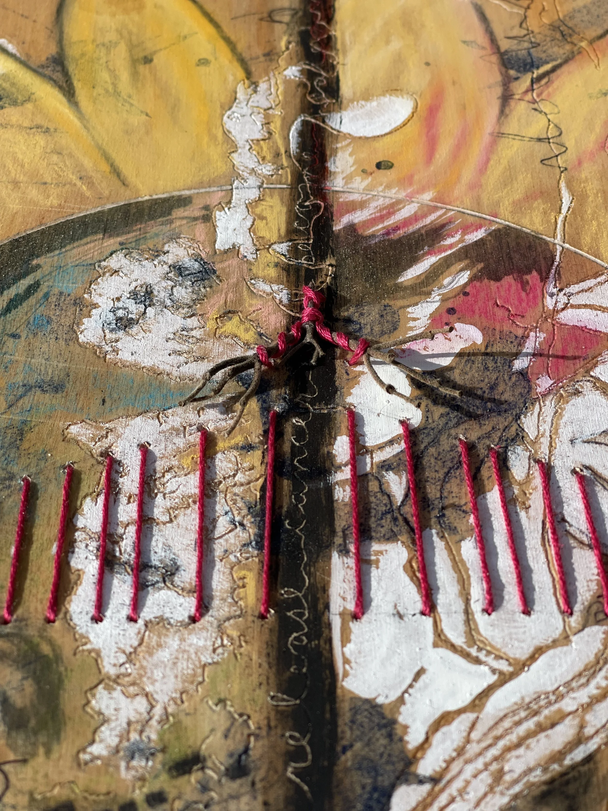
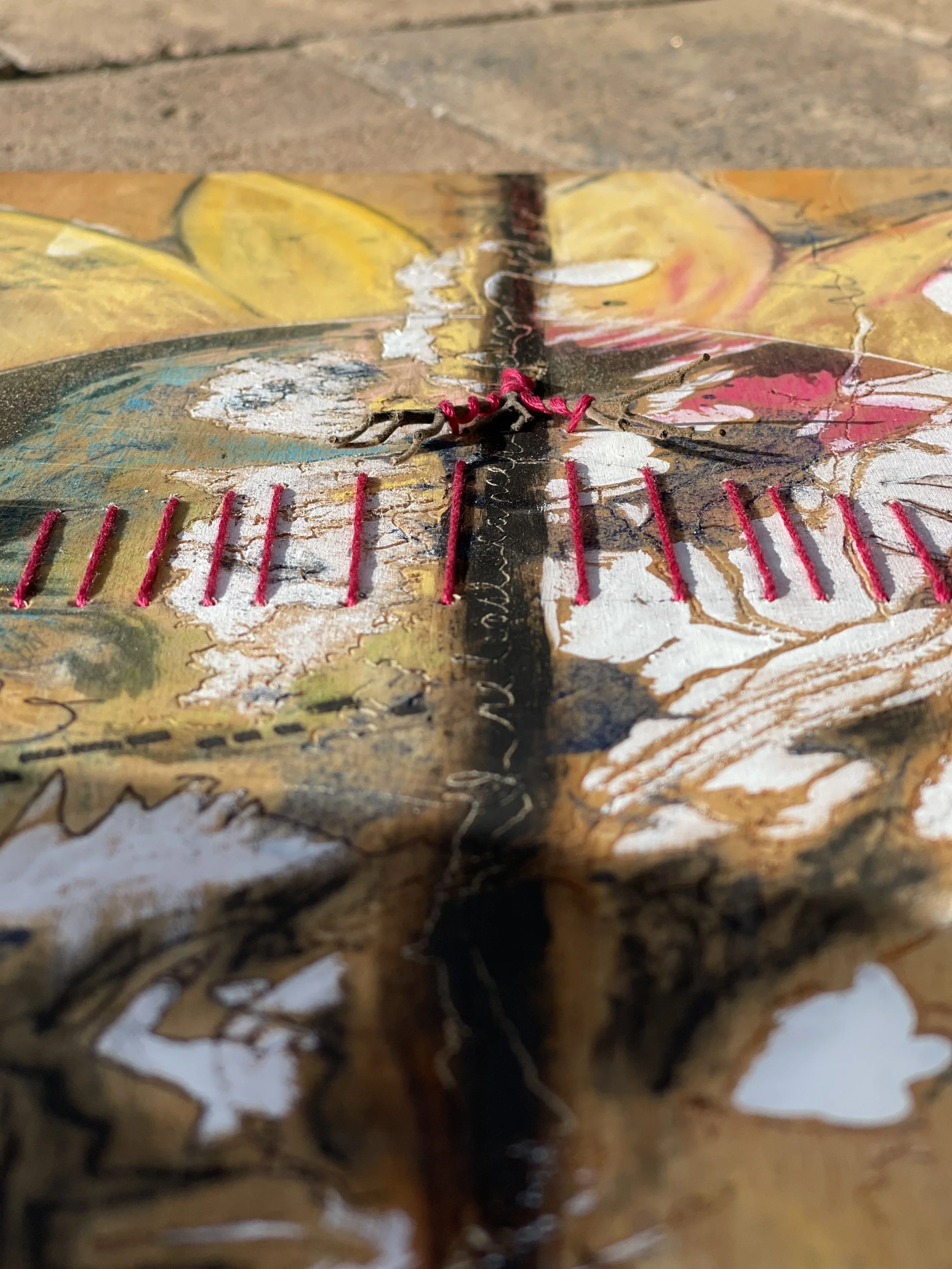
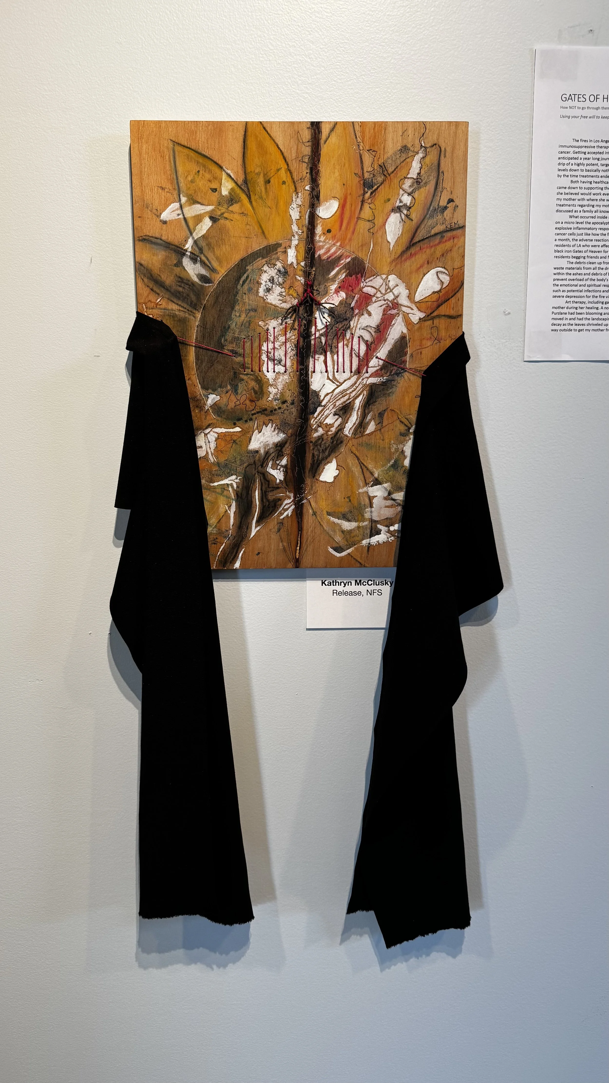
Now it was time to incorporate my mother’s experiences by creating a piece of mixed media artwork called “Release” that perfectly summarized the previous events in a visual form. Taking a few stems from the withdrawn Rock Purslane, I made shadows on a wood panel that were outlined and carved. Already part of the wood, what looked like the thin line of smoke from a blown out flame streaked through the center and became the backdrop for my mother’s affirmation “I release cancer and become healed”.


PLANETARY PARADE
Interestingly, on a larger scale, seven of the eight planets within our solar system aligned in a “planetary parade” during this time. This meant multiple planets appeared in the same part of the sky, often along the ecliptic, which is the plane of the Earth’s orbit around the sun. Mercury was the only planet to not take part in this parade, but everybody else joined. Visible to the human eye, Venus, Mars, Jupiter, and Saturn lined up while Uranus and Neptune followed suit and could be seen by binoculars or telescopes. This occurrence caused a magnetic shift that attracted elements back into alignment. My mother, slowly transitioning back into a state of health and the LA fire victims into new locations in life. Both hopefully bringing a shift in the direction of fulfilling their life purpose. Therefore, in my mother’s artwork a sphere symbolizing these planets made its way in the center with the petals of a sunflower blooming around it to illustrate new growth.

“I’m not ready yet. I can do a lot of good in the world. I can cook for people.”
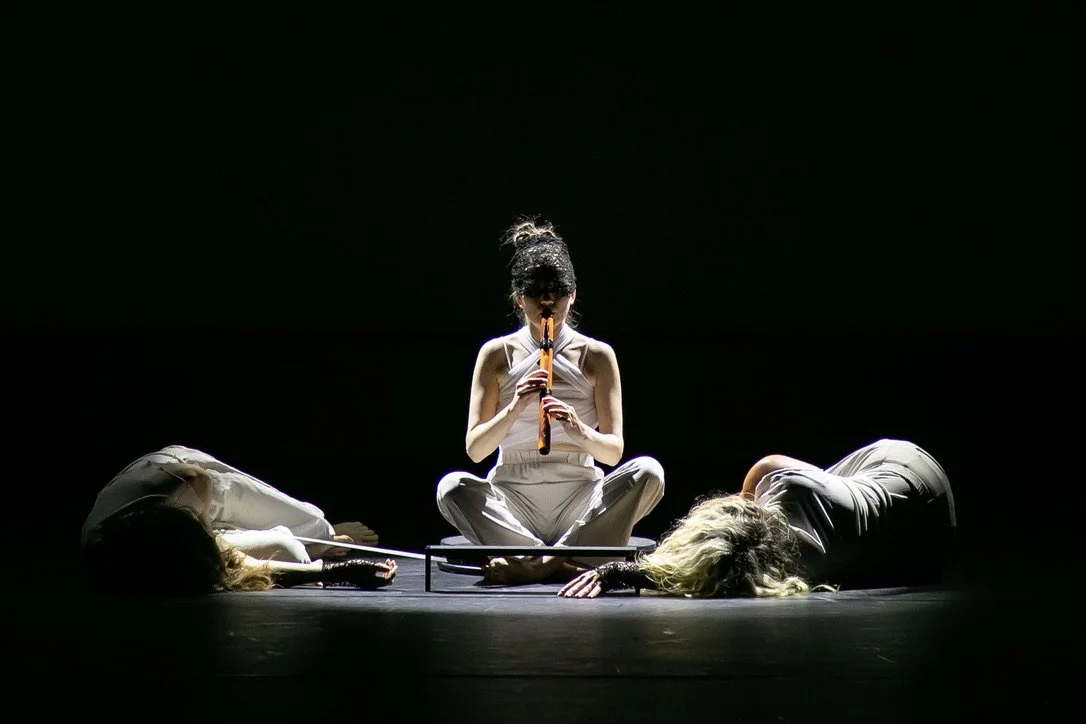
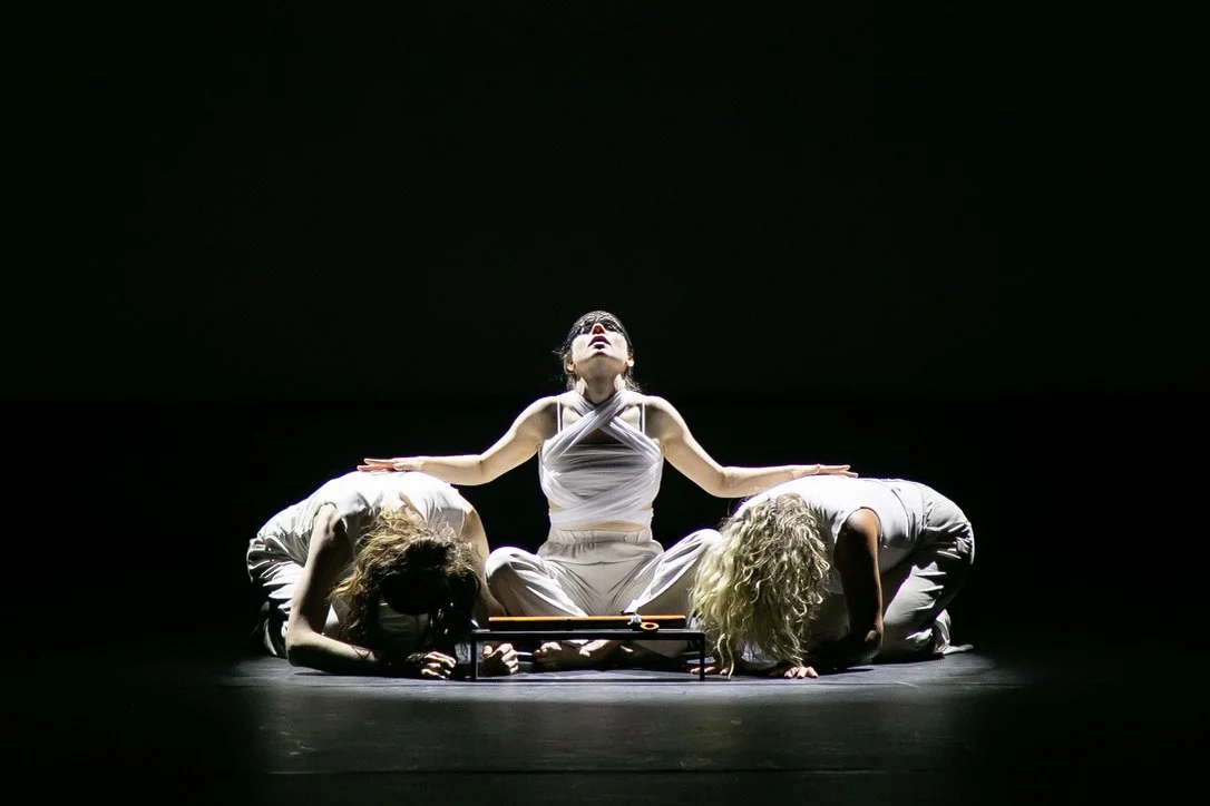
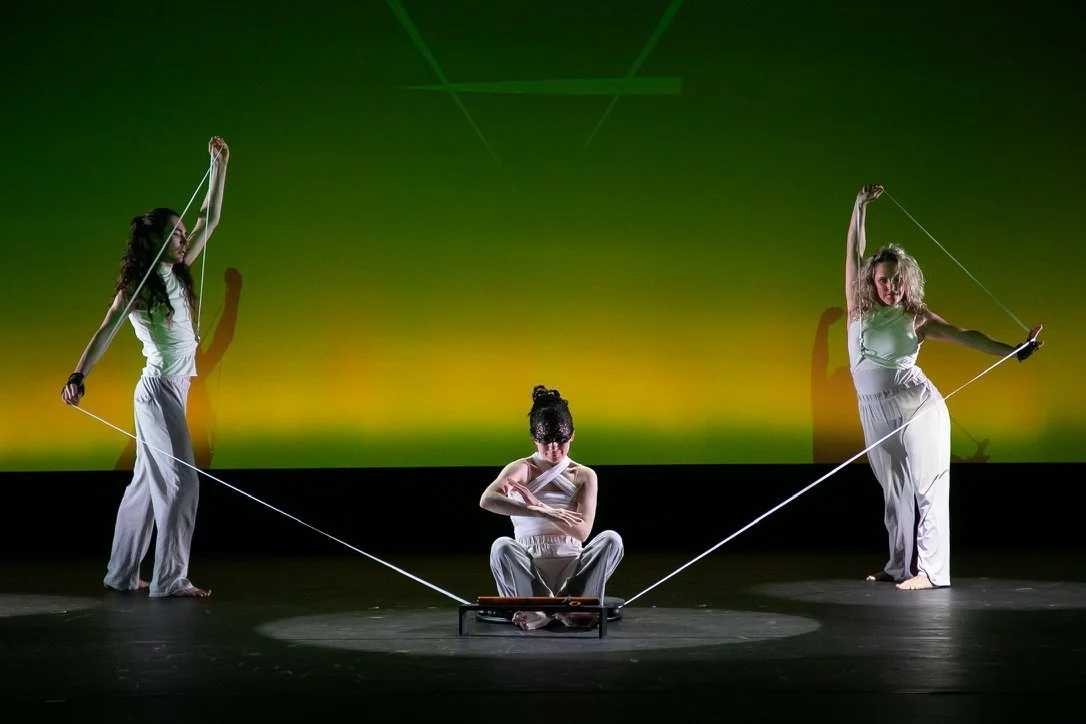
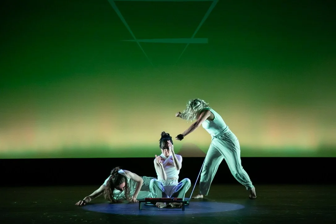
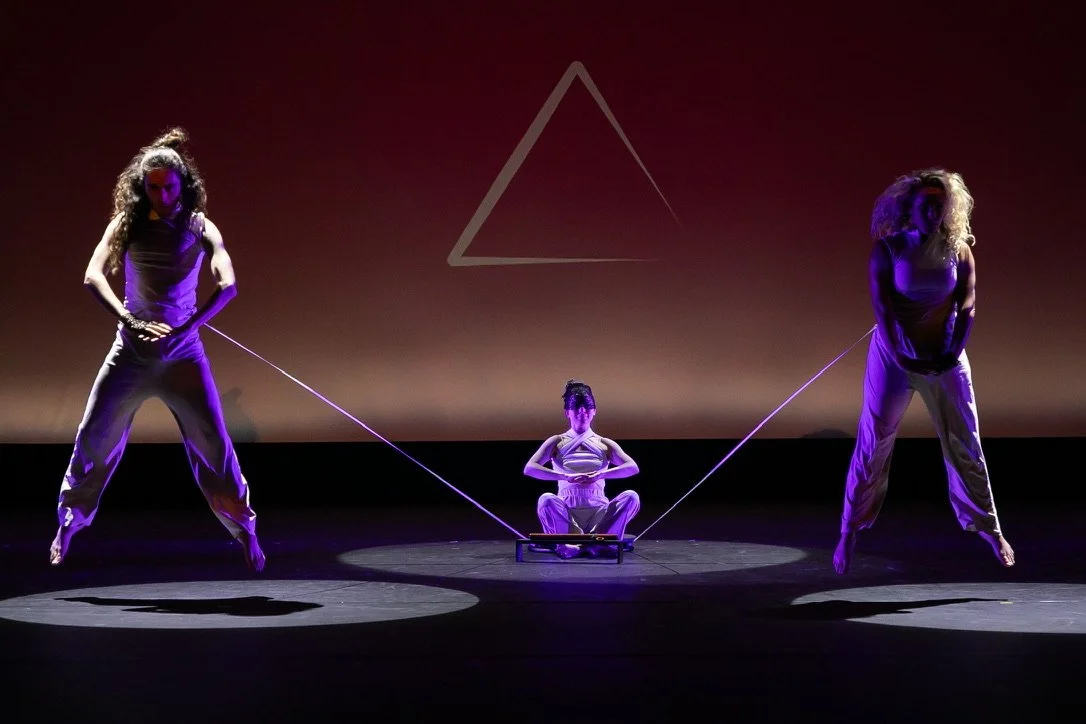
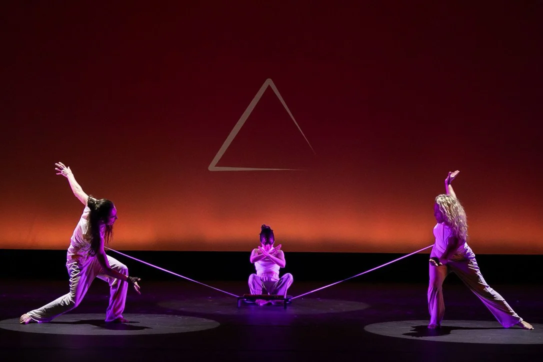
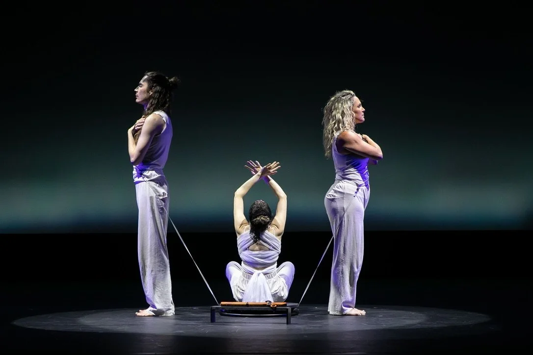
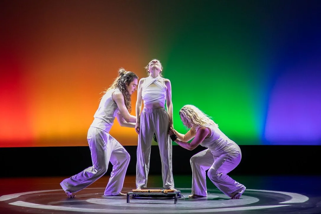
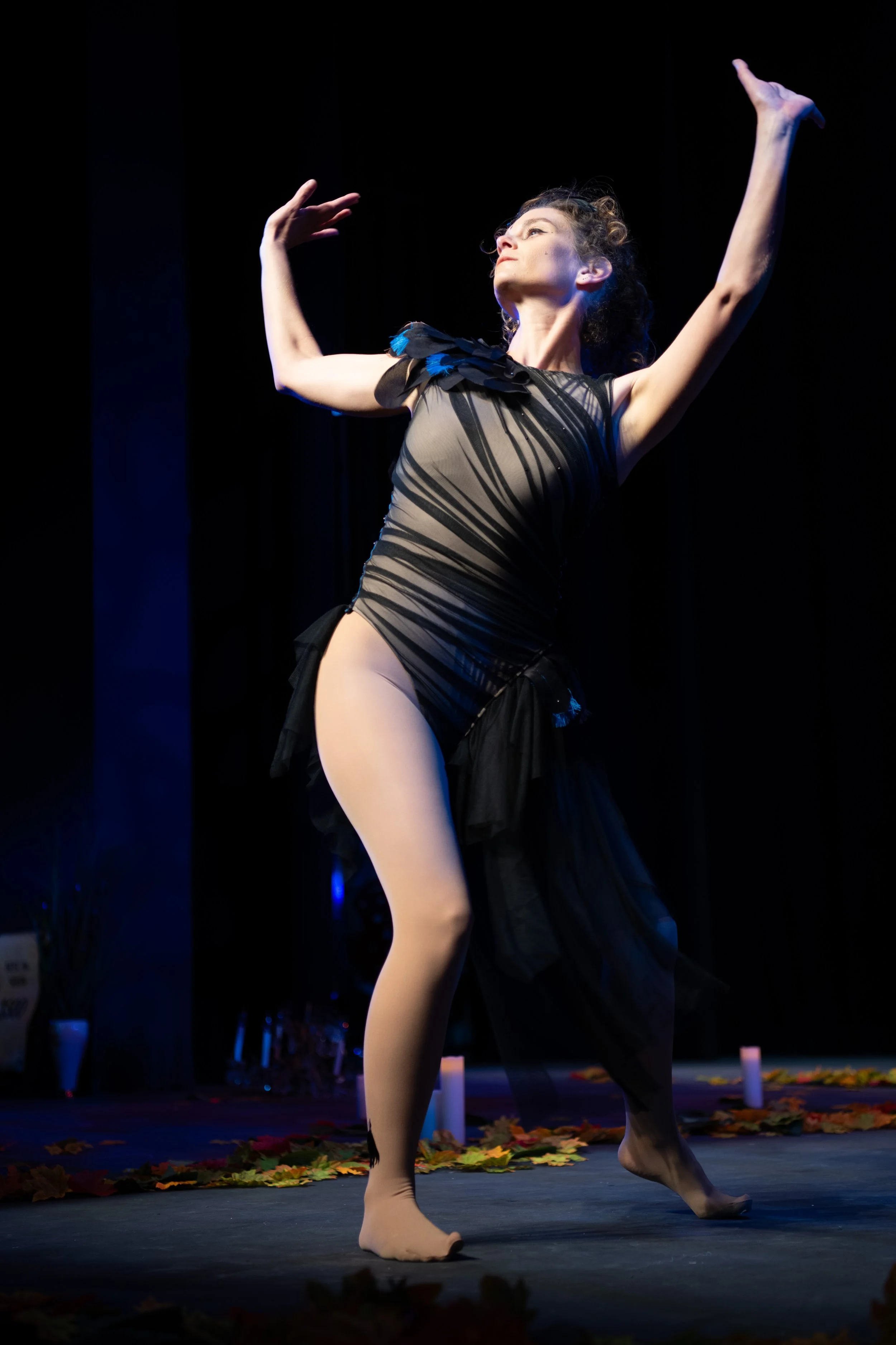
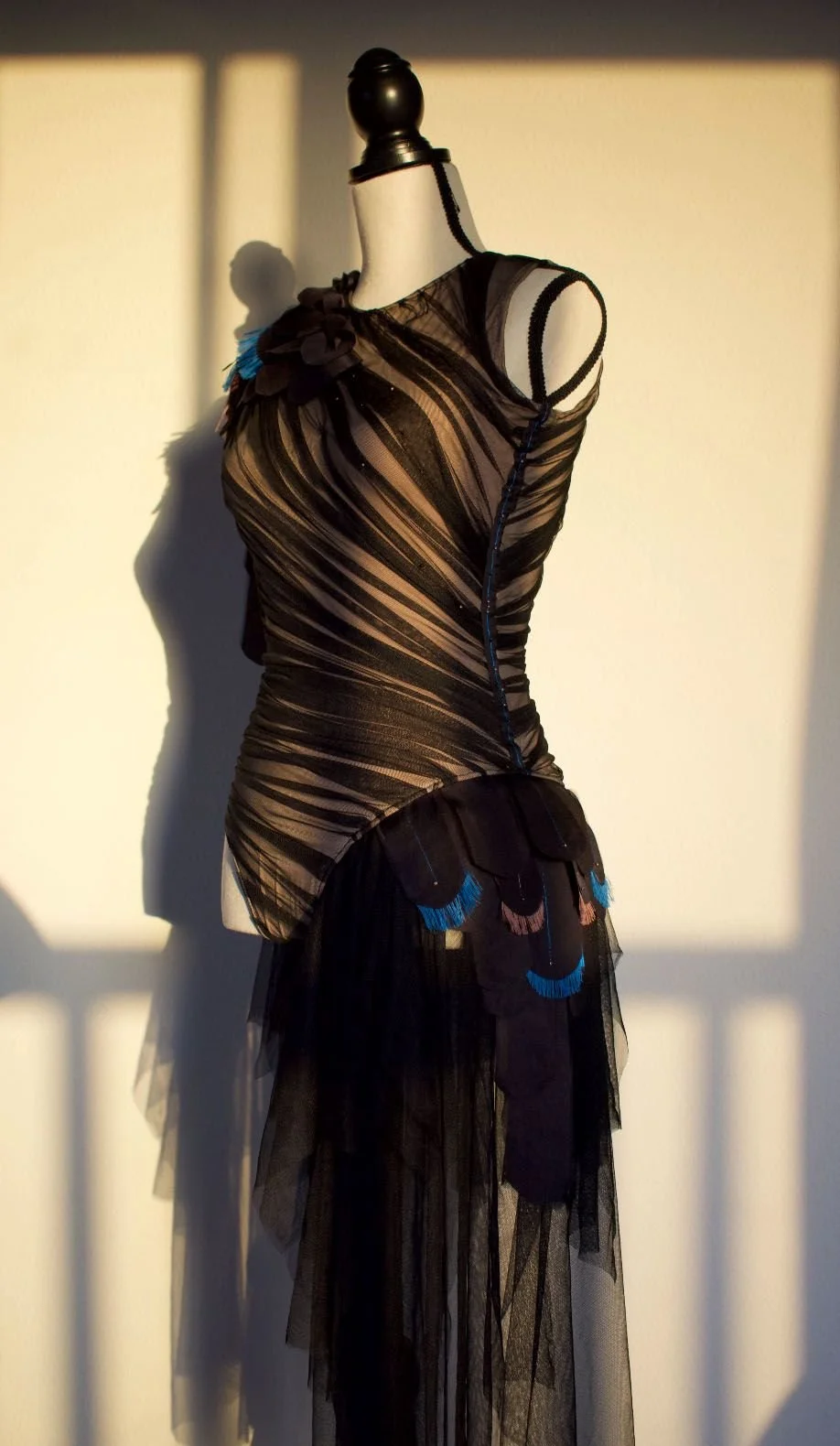
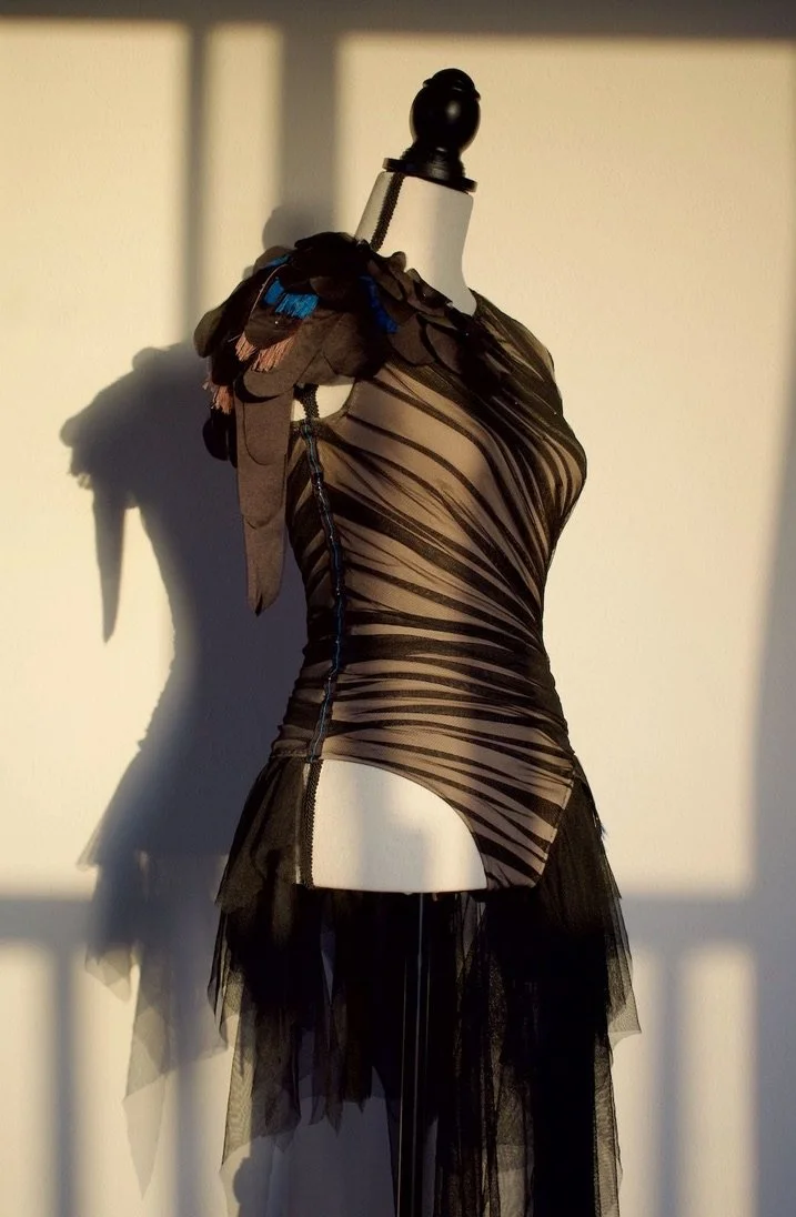
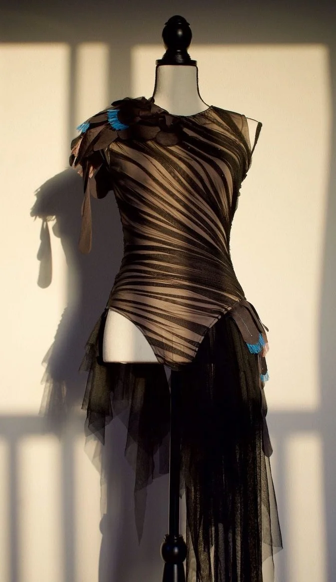
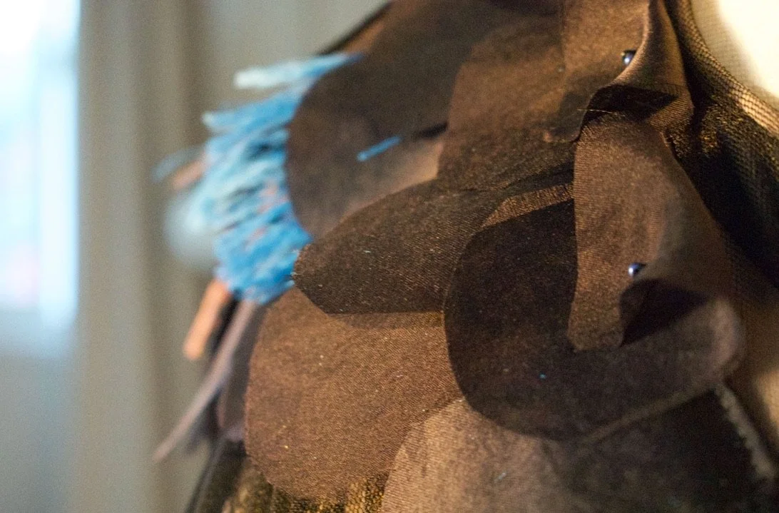
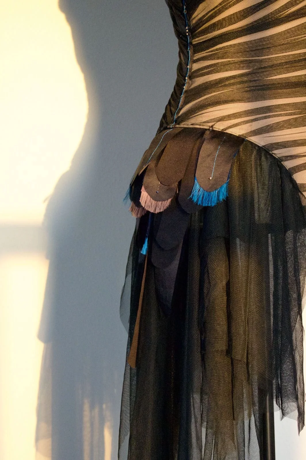
My mother always had such a strong will. This message she wordlessly delivered to the Supreme Being who had arms stretched wide open above the Gates of Heaven ready to receive my mother back home during her NDE, brought my mother back to this Earthly physical plane eager to perform her service. She lay alone on a gurney in the Emergency Room during this experience. Waiting for a hospital bed post swelling of her airway due to a rash from the toxins trying to escape her body through her skin left her almost intubated and sedated. Our family sensed the awe in her voice the following morning when we heard about this experience. She described the thin metal rods on each periphery of the gates that moved into larger rods that made its way to the center arching upwards towards a central peak where the Supreme Being presented on a different plane than where my mother stood. Unable to fully comprehend in a piece of artwork what this visually looked like for her, an embroidery string showing thin and thicker lines seemed to be the simplest, most efficient way to go. This same string holding up a black cloth tied only by a bow in the back showed how the act of releasing this cloth that represented her cancer could be the mental power my brother and I hoped she would develop from the beginning to help heal herself.
WHAT DID I LEARN?
I learned through this experience to let the Greater Plan be the highest good for all. I myself had a discussion with this Supreme Being before my father and I left my mother in the ER room to get some needed sleep. Holding her left hand quietly chanting, I delivered my own thoughts through the melody, “If it’s her time, take her. I let my mother go for You know what’s best for her.” This realigned me to my own purpose in life; to be a channel for God’s divine healing to move through if He knows it’s what’s best for the individual. Being ready to accept my mother back home, He couldn’t resist my mother’s free will to keep doing her service here on Earth. For all the fire victims in LA, may you see the hand of God stretched out ready to help you as you use your free will to keep going, find a greater purpose in life and realign yourself to the Greater Plan through this horrific tragedy.
Written in morse code on this artwork, the word love reminds us all of the attractive force that is pulling and aligning us back to our true self and the work we’re meant to accomplish in this lifetime.
.-.. --- ...- .
“Release” artwork was on display during the FLORA art exhibit at the Coastline Art Gallery in Newport Beach, CA from April 9th-25th, 2025. Below are photos from when my mom, myself and a few friends and family members went to visit the gallery during the showing.


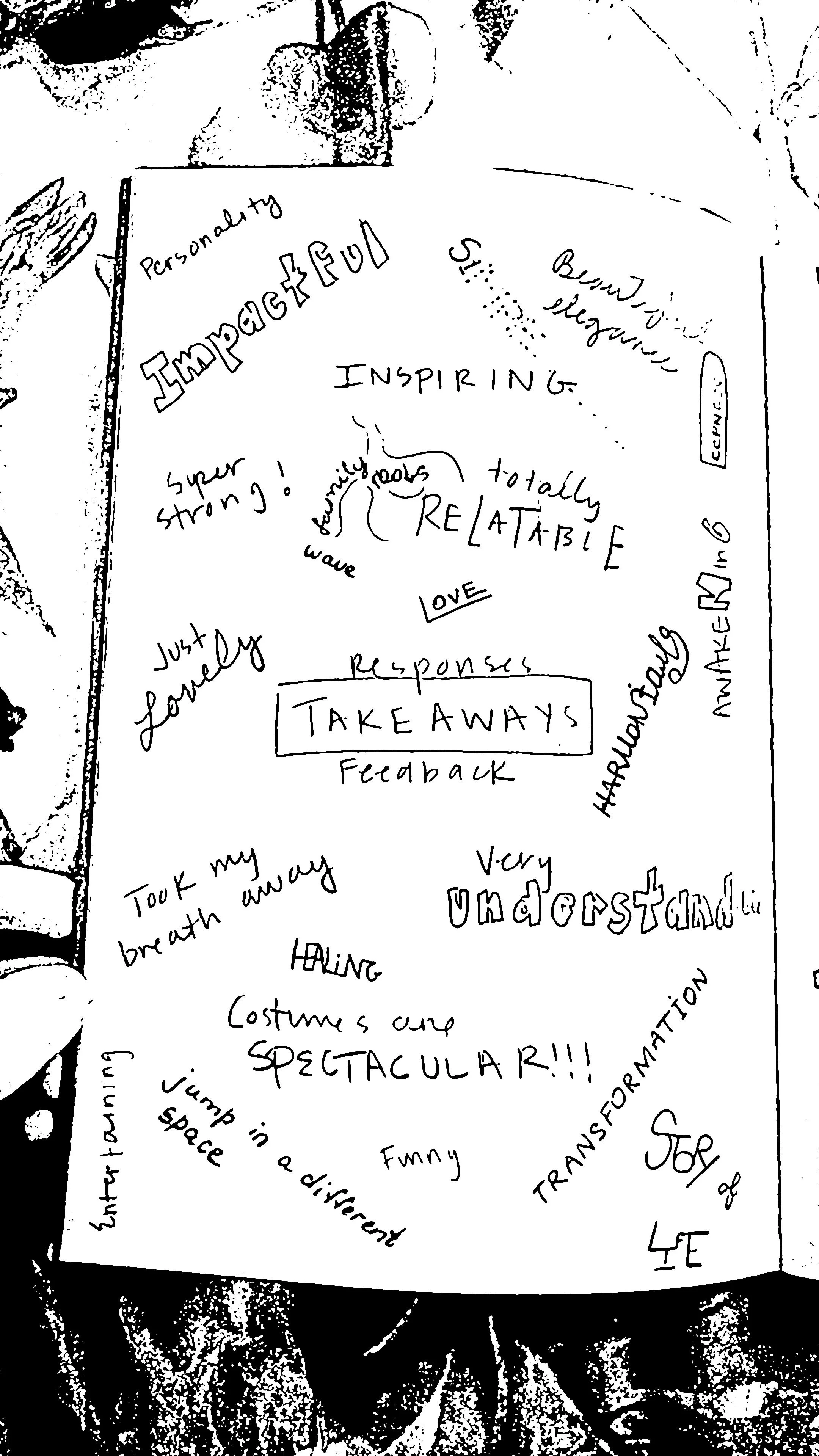
FEEDBACK
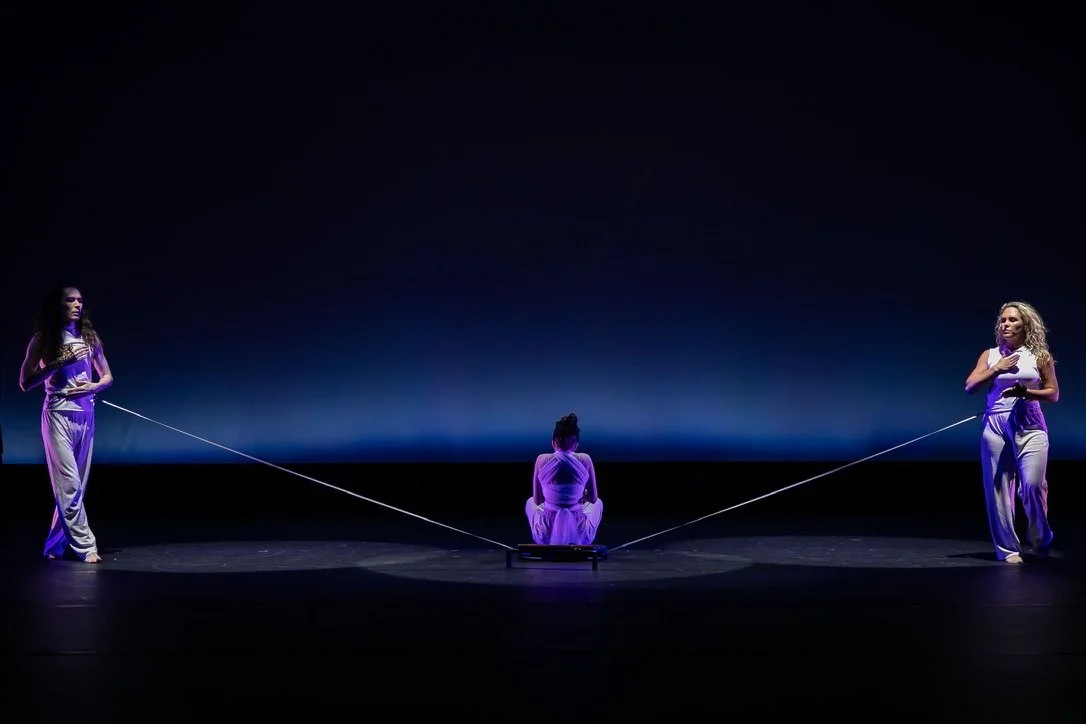
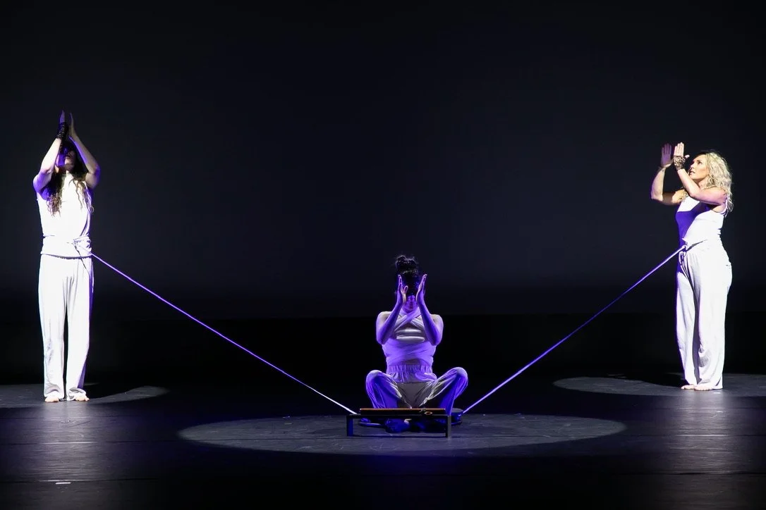
Two dog leashes attached to a swivel base.
My philosophy has been to “ask for forgiveness”. I’ve learned when coming up with new concepts like this one it takes more time trying to explain what you want to do versus simply showing them. Therefore, when Viktoria and I got introduced to the theater set designer at the college, we moved quickly on picking his brain about the lazy susan part. He knew right away it needed to be stable enough to hold a person and recommended a circular ¾” piece of plywood attached to a heavy duty furniture swivel base, which would hide the dog leash handles attached with zip ties. Another brilliant mind. All the right people were coming together at the right time to make this happen. After all was said and done, the dance department chair found out what we did and granted us the approval we needed after finding out the prop was safe enough to use for the stage.
STORYBOARD

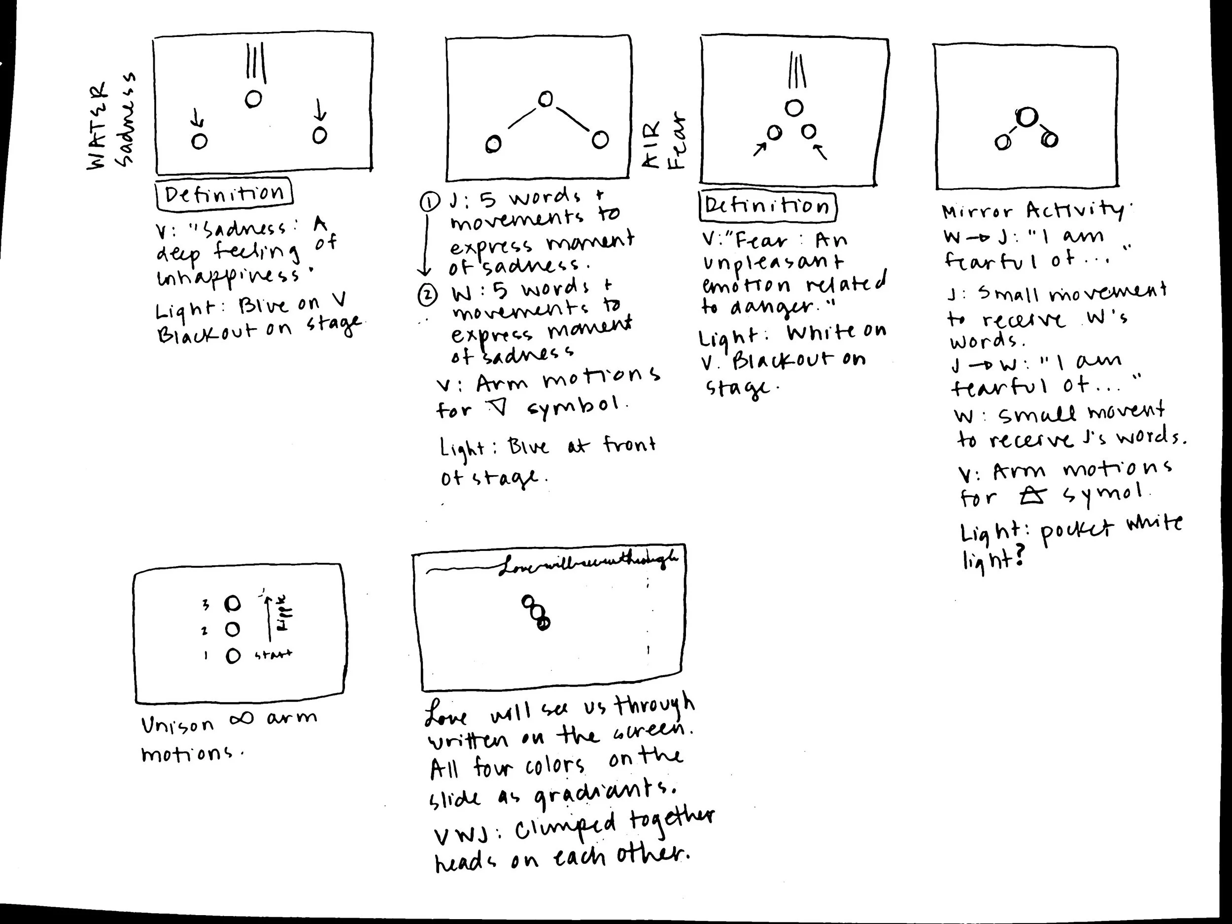
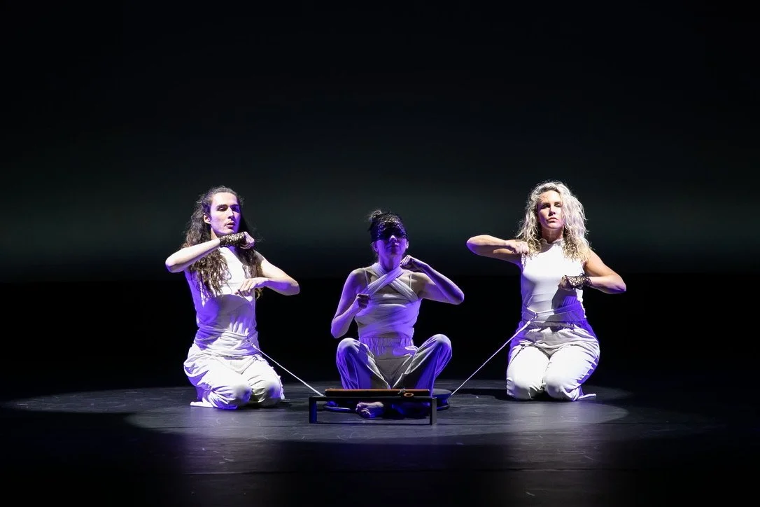
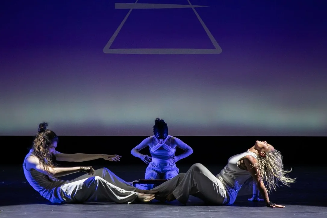
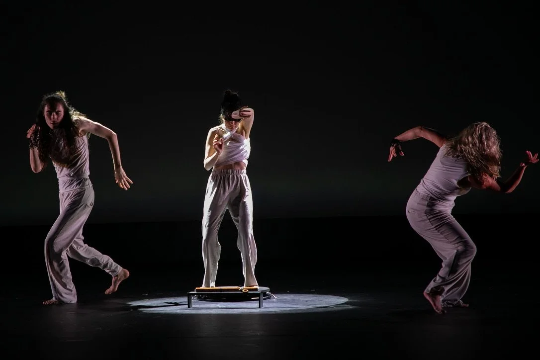
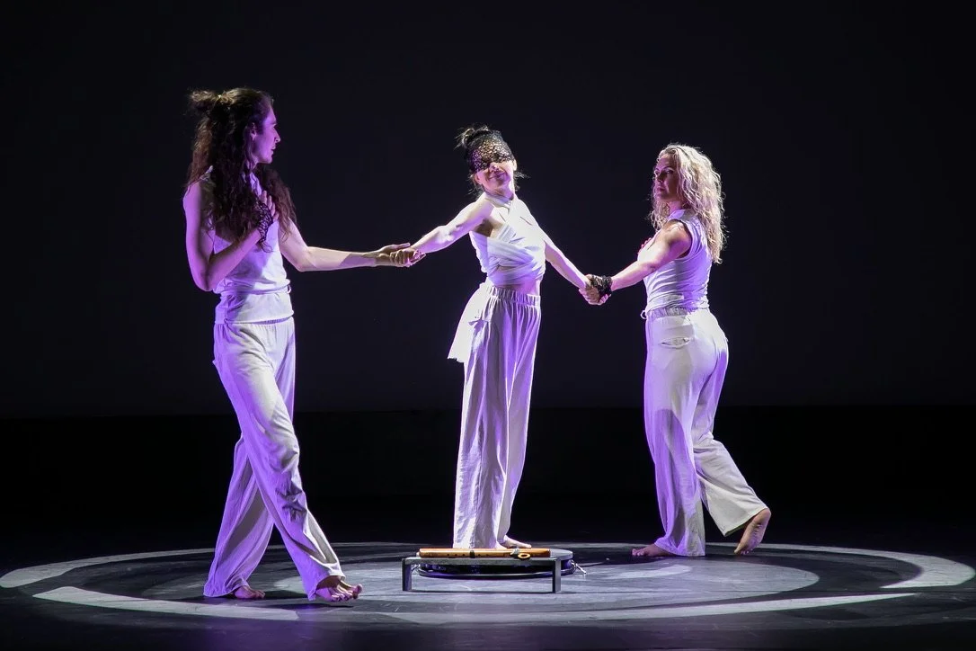
We wanted “Elements” to be a montage of a human life. Awakening with breath and heartbeat, the dance moved through the four elements of earth, fire, water and air showing the balance and imbalance of each. Concluding by rising above these four elements into a higher vibrational state of unity, peace and love, it reminded us that intuition is the center of wisdom. The pure compass within us all.


MEASURE OF SUCCESS
“Measure your success based on how much fun you’re having.”
I read this quote online during our process of developing this piece. Normally I would stress over the pressure of creating such a number, but when I flipped my thinking to measure our success based on how much fun we were having, that’s all I started to care about. Viktoria and I’s choreography sessions were full of laughter and ease, our dance rehearsals became even more harmonious and collaborative, and we accomplished tasks such as mixing our own music, designing our own costumes, putting together our own slides for the cyclorama and hand painting our swivel base with an eye.

“You Are Awesome” cards we would select before practices & performances.
The same message transmitted through Viktoria as she shared her thoughts with me:
“I noticed how I have less importance on the result, and more attention to the process itself. The result used to be important and I wanted to be better than everyone else, but now the result is not so important. If the process of creation is filled with pleasure, then this is already a wonderful result.”
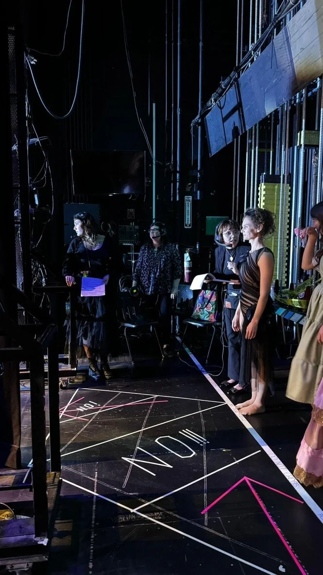
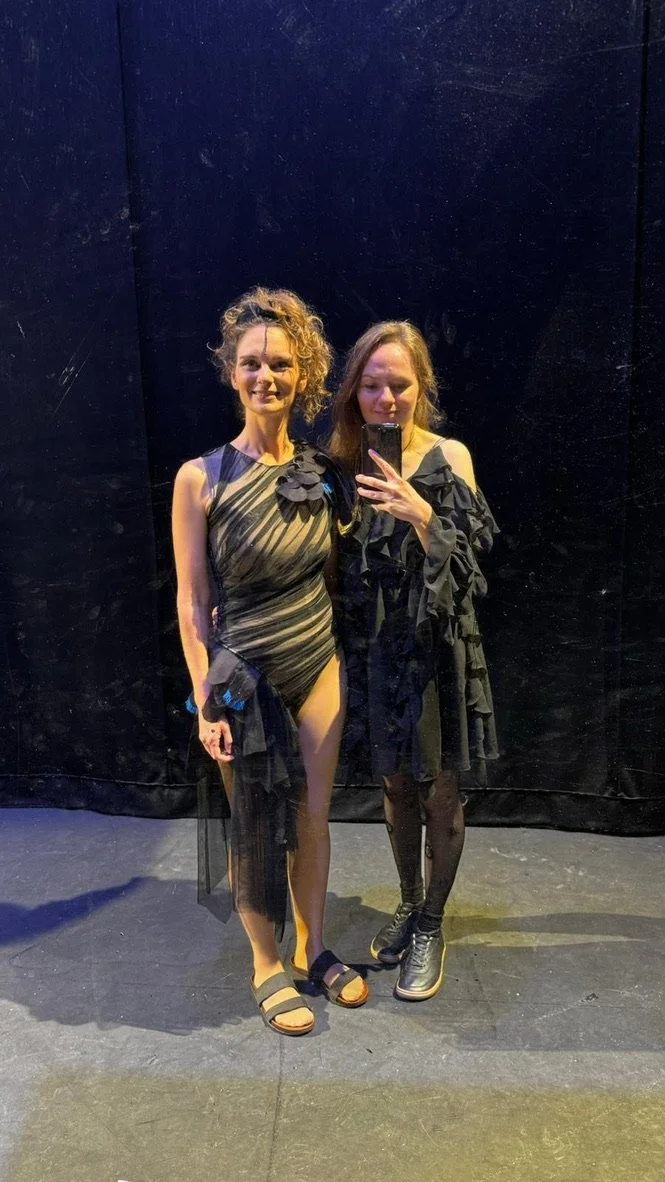
PERFORMANCE PHOTOS


CREDITS
KATHRYN MCCLUSKY
Co-Choreographer
An innovative soul who brought an interdisciplinary artistic performance about a relatable life concept to the stage in a simple and extraordinary way.
VIKTORIA TAUZ
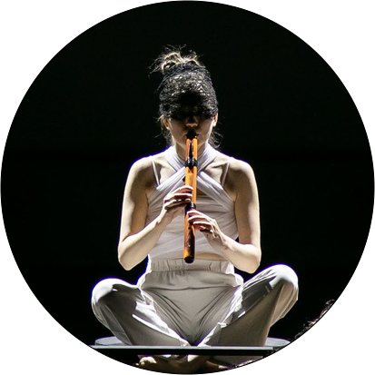
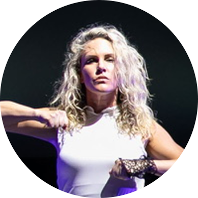
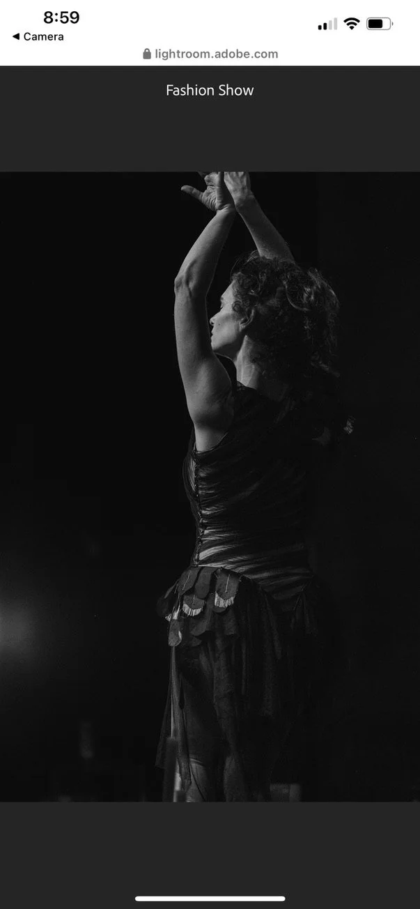
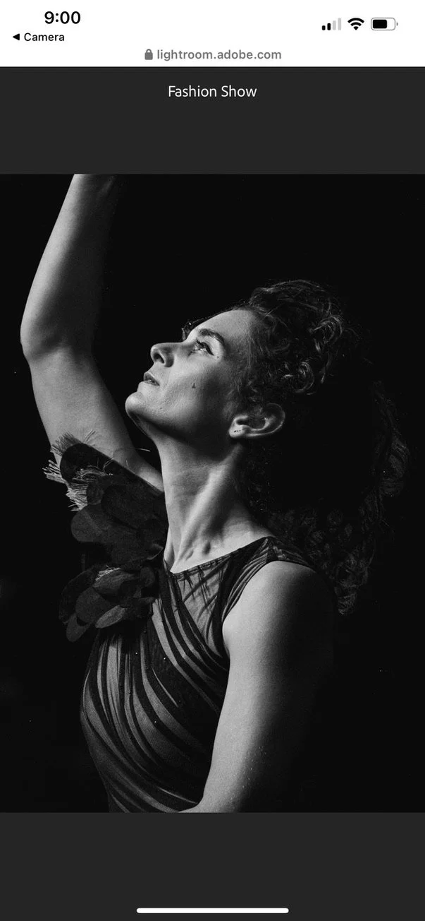
Co-Choreographer | Composer | Costume Designer | Native American Flutist | DANCER: Masculine - Feminine - Intuition
A highly creative soul who surpassed all limitations with her choreographic ideas and brought a playful, joyous, uplifting, intuitive presence to this piece.
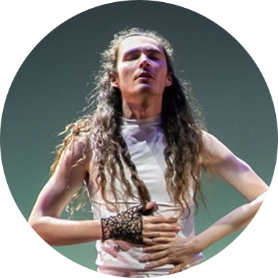
WYATT DAVIS
DANCER: Masculine - Feminine - Intuition | Collaborator
An artistic and intelligent soul who brought his lighthearted, loving, calm, masculine presence to this piece.
JAMIE BRINKMAN
DANCER: Masculine - Feminine - Intuition | Collaborator
A deeply rooted soul who brought her powerful, grounded, beautiful, feminine presence to this piece.
OUR PURPOSE
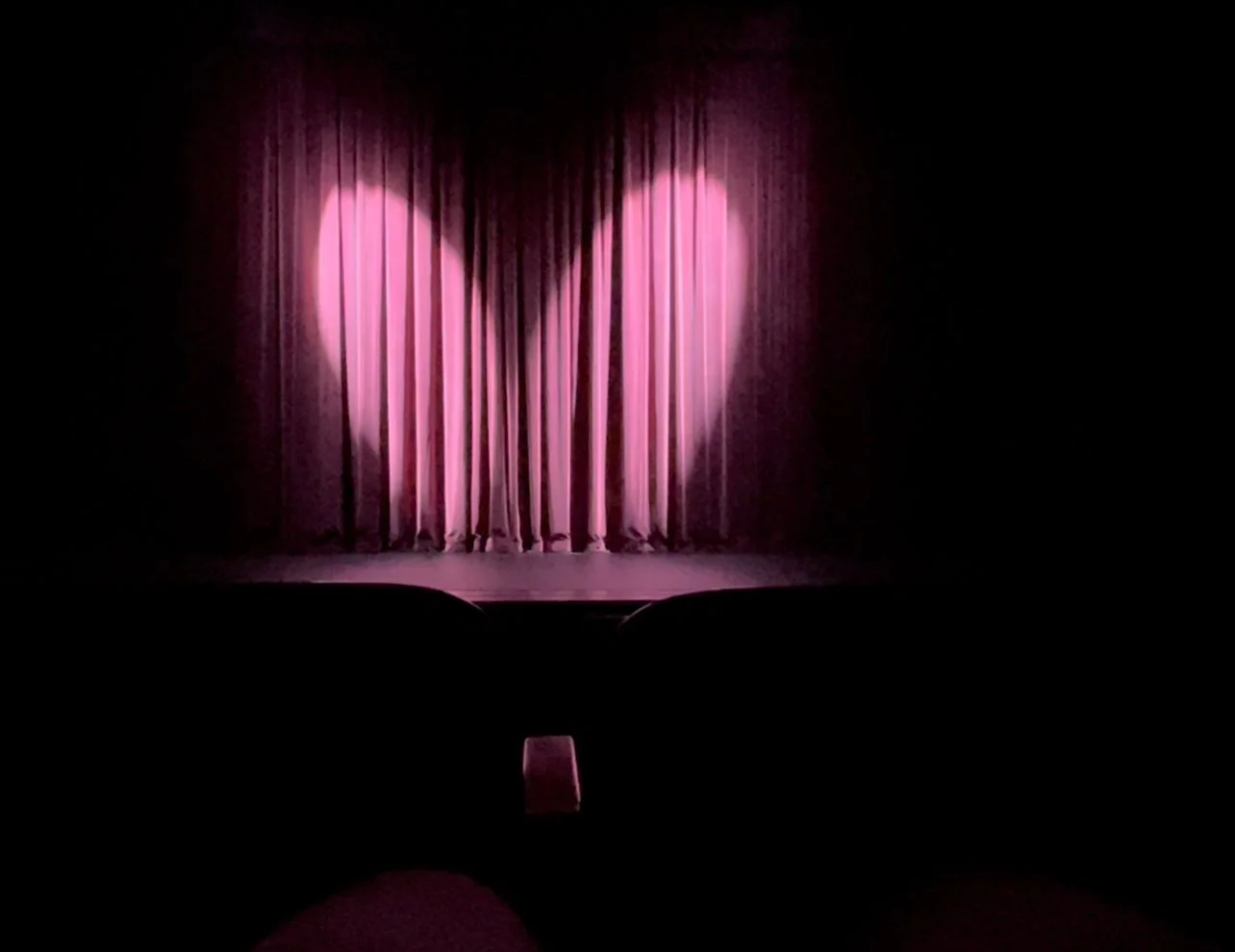
To show others in a dance form that there is a way to live in a higher vibrational state of love and unity while in the body and beyond. During our on stage rehearsals, the theater manager played around with the lights towards the end of our dance. Two nights in a row a heart shape showed up on the red curtains. Of course I snapped a photo and smiled knowing we were fulfilling our purpose, to leave the audience with this feeling of love.
Even though there remains a crack in my necklace, it will forever remind me of the battle I’m fighting against the forces in life that try to pull me down. As I keep my shield of armor in place or in this case around my neck, I create a barrier to guard myself from these elements and protect this place of love I wish to always hold within myself.
Let this dance be a reminder for you to hopefully do the same.
Video Timestamp: “Elements” 23:29
2024-05-09: Sacred Threads
SACRED THREAD | an organic state of destruction bringing people together through the invisible strings connecting us all
There are certain people you meet that seem to be instant friends. Some could argue that it’s because of shared interests that bond people immediately together and I have known this to be true, but I also understand that these bonds can seem much deeper than simply sharing a common like or dislike.
As the first law of thermodynamics states, “energy cannot be created or destroyed. It can only change form or be transferred from one object to another.” When we change form by destroying the outer body through death, this invisible string or sacred thread keeps us together until we can meet again with a different outer garment needing to learn each other’s new names and faces.
This is how I felt with my dear friend Viktoria whom I met in fall of 2023. Both of us had come from different places in the world, Viktoria from Ukraine and myself from Texas, and we landed at the same school in the same modern dance class. We instantly became friends and it was clear the timing of our meeting was divinely guided to help support one another during our particular periods of growth.
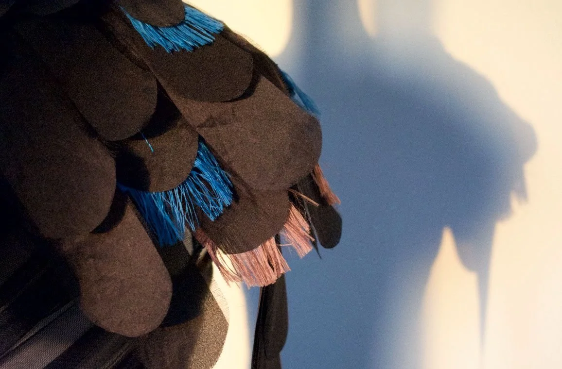
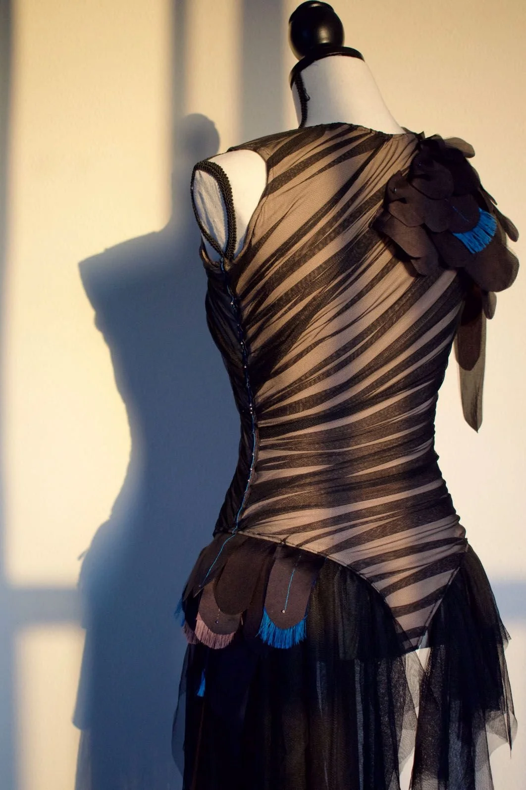
Prioritizing our artistic avenues of interest was apparent for both of us as we had each been through other careers during our earlier years that we knew we had to learn from in order to get to where we needed to be. Viktoria was an accountant and graphic designer while I had worked as a nurse and done property management. Watching each other reconnect with our artistic talents was motivating and inspiring for us to see. We continued to collaborate with one another through dance, voice, and fashion, landing an opportunity for me to showcase Viktoria’s uniquely designed hummingbird dance costume down the runway during the Saddleback College Spring 2024 Fashion Show on Thursday, May 9th, 2024 that just so happened to be called, “Sacred Thread”.
INITIAL PHASES
Anything Viktoria touches turns to gold. When I saw her initial sketches, I knew the outcome of this piece was going to be good. The hummingbird symbolizing the following:
A highly developed, open heart
The ability to fly backwards
Being brave, cheerful , and fearless
The path of the soul, when through serving other people, a person gains the joy of being and trust in what is happening
An immortal soul and creative energy
Viktoria skillfully collaborated with Tetiana Markova to construct the costume. Over the next couple of months, I met with her for fittings, each time being more and more impressed with what was surfacing.

FINAL PRODUCT
The outcome was GOOD. Real GOOD. Far exceeding anybody’s expectations.

CHALLENGES
Anything good always comes with its challenges.
Viktoria had a vision for how she wanted the costume to be presented down the runway with myself improvising dance movements and poses to tribal inspired music. Because this wasn’t Viktoria’s own runway show, she couldn’t do whatever she wanted. We had a bit of push back as the fashion department wanted our number to fit within the theme and protocol set out for the rest of the models. We understood and chose to collaborate as best as possible finding the happy medium between both sides.
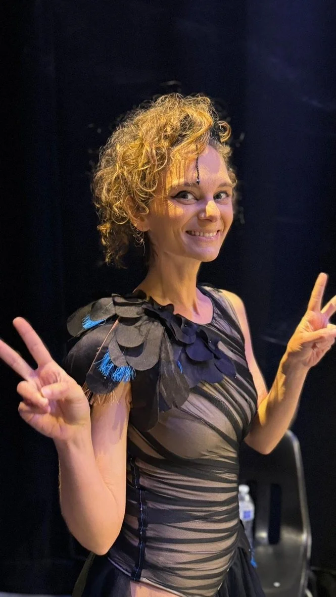
The hair and makeup became another issue. Seeing the fashion department’s vision board, their model looks consisted of slicked back, wet looking hair with dark, smokey eyes. Total opposite of the curly hair mohawk updo and light eyes with black symbols / dots precisely drawn on my face look that Viktoria was hoping for. Again, we chose to keep working towards a middle ground without fully giving up on Viktoria’s vision.
PERFORMANCE READY
The day of the performance became a different story. As I sat in the chair getting my hair and make-up done by the cosmetology department, there was no resistance from the fashion staff. Viktoria expressed what she wanted done and it all became a go. After, I went to do a test run of my walk / dance down the runway and the lead gal pulled me aside and said, “You know what. Go for it. I think you should dance the entire time even in between your poses.”
Getting my hair and make up done by the Cosmetology Department.
It was a good lesson to be learned. To hold your vision, but do so with love. Meaning harmony is more important than what you desire and most of the time it’ll end up working out better than you ever would have expected.
PERFORMANCE
PHOTOS


WHAT NOW?
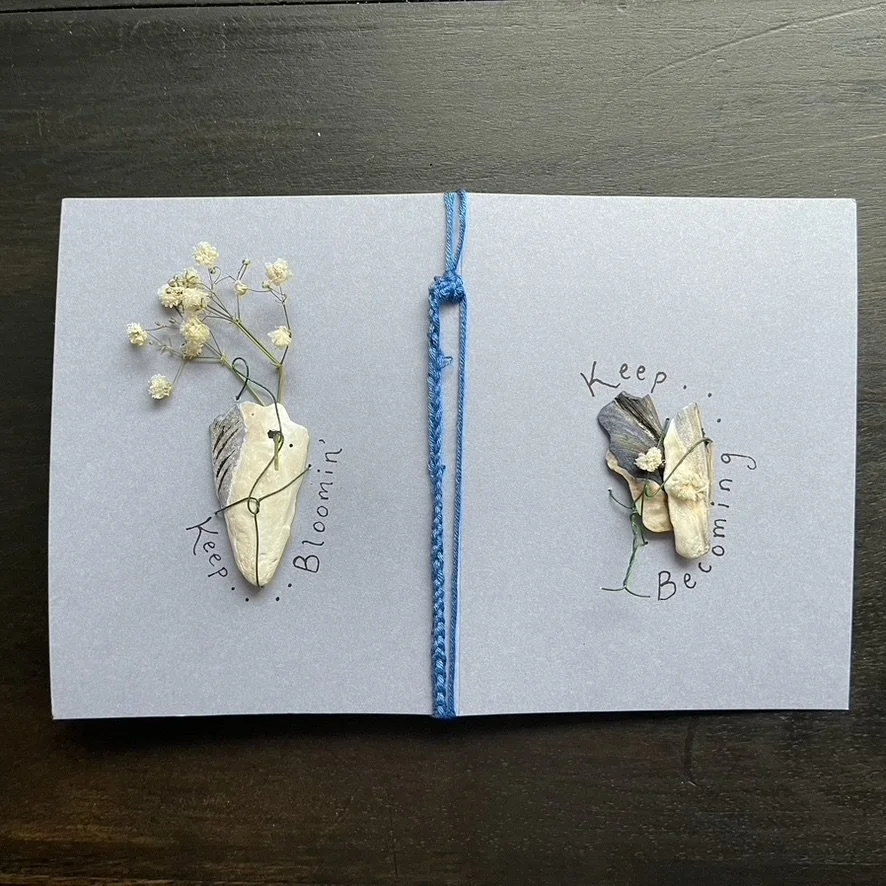
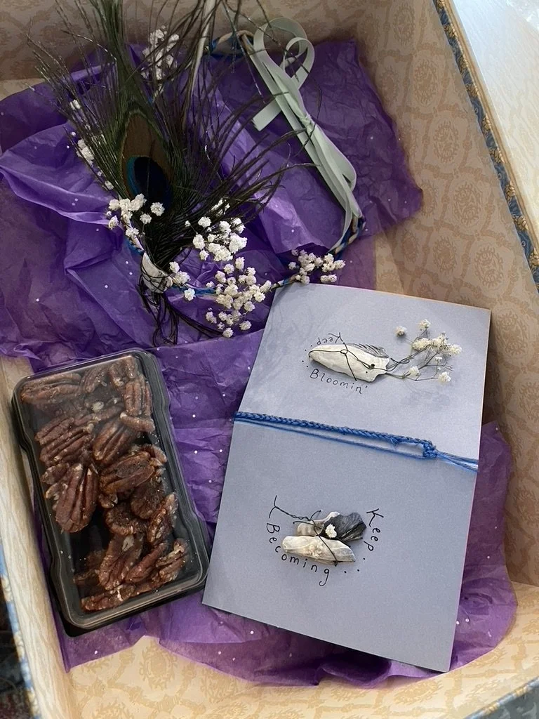
The hummingbird costume adorns a mannequin in Viktoria’s art room. It’s new additions…a peacock feathered crown with a card that says, “Keep bloomin…Keep becoming” that I made for her to match it.
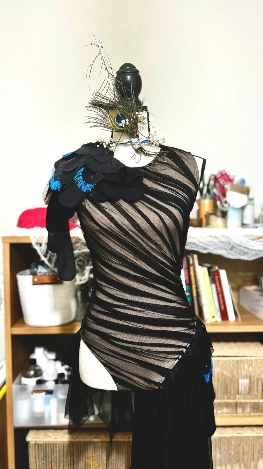
I have a feeling this costume is going to come to life in a future dance performance using this beautiful theme of sacred threads and friendship that not only shares my story and the many lessons learned from it, but many others as well. We’ll hold this vision with love and see where it leads us.
Til then my friends…Peace out!
HOLD ON - NOT SO QUICK
FAST FORWARD Seven Months
Remember I predicted another performance with this costume. Well, it happened. An informal dance concert at Saddleback College on 12/16/2024 where I performed a solo piece entitled “Wake Me Up”. Music by Simply Three. This piece symbolizing coming back to ME. Finding myself again. Of course Viktoria was in the audience and she got a big shout out at the end. Check it out below.
Maybe we’ll get MANY more performances with this gorgeous costume. Let’s wait and see what the universe has in store for us and this lil’ hummingbird.
CADE’S INSPIRING STORY
Watch the video below to learn more about our guest speaker, Cade Spinello
Jessie Rees Foundation
Encouraging Kids Fighting Cancer to
NEVER EVER GIVE UP
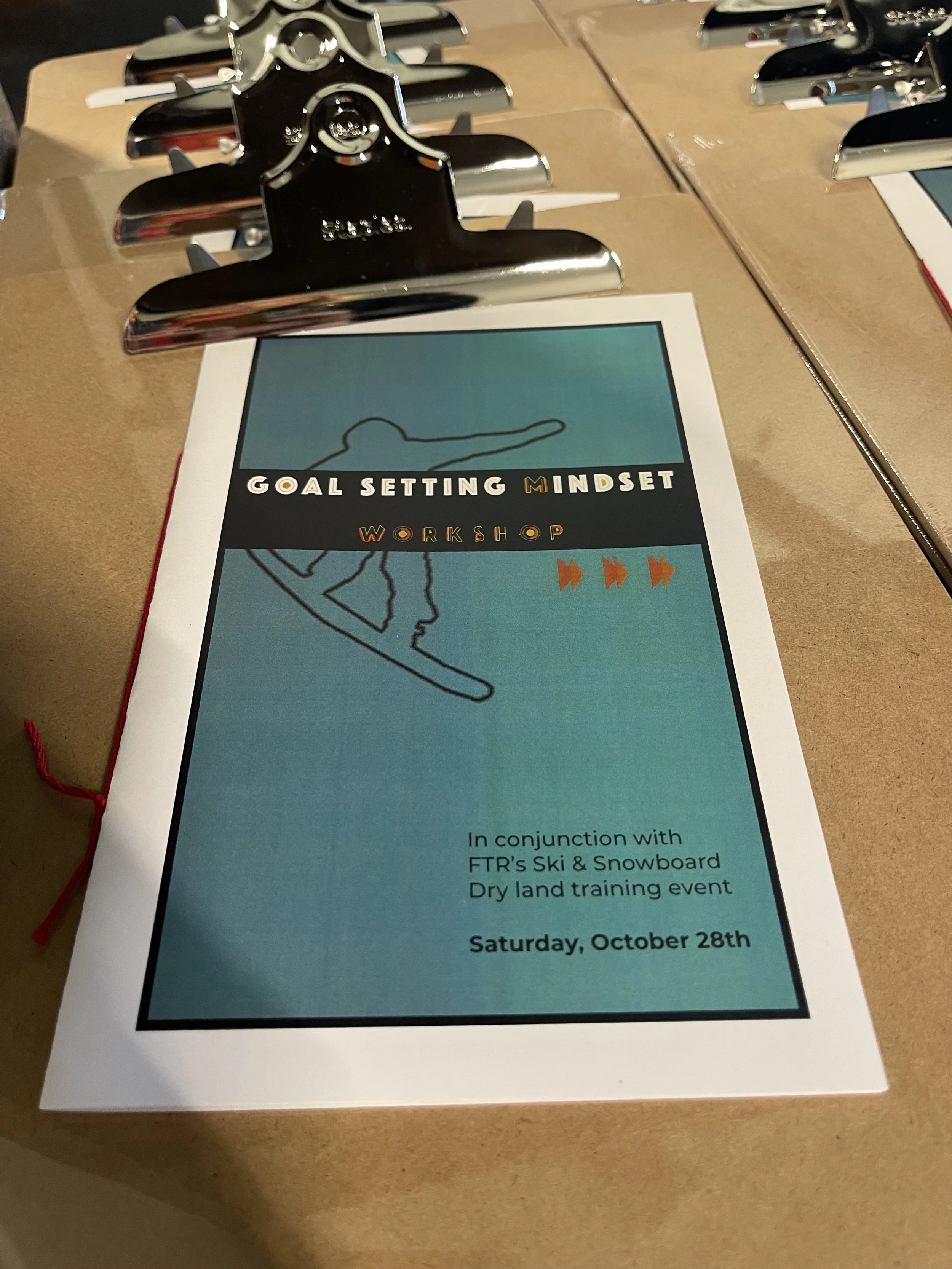
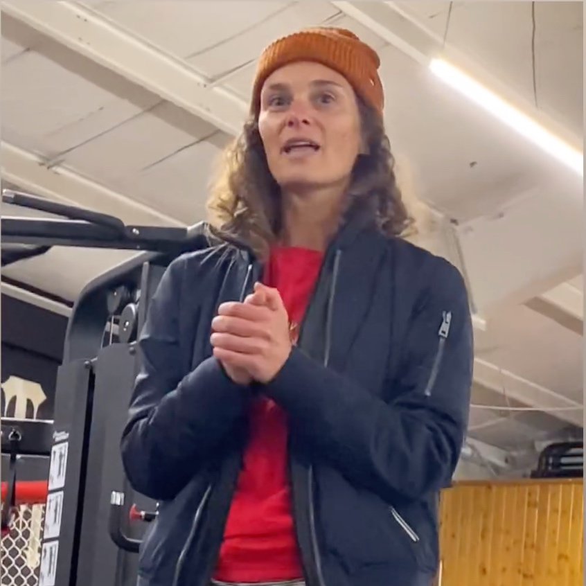
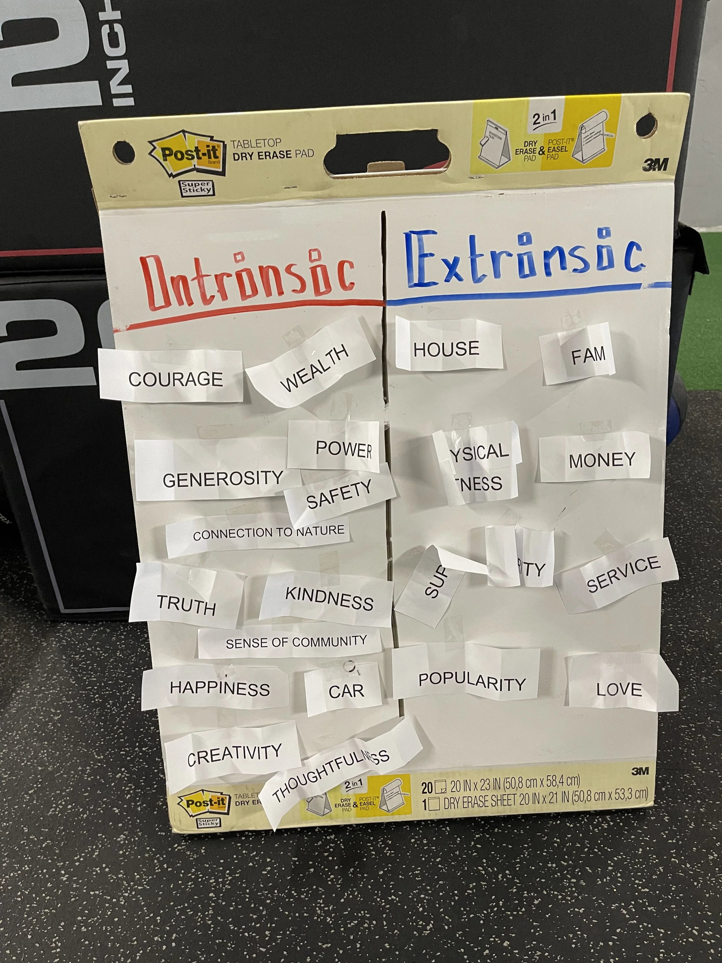
2024-09-18: Reality Check Workshop Part I
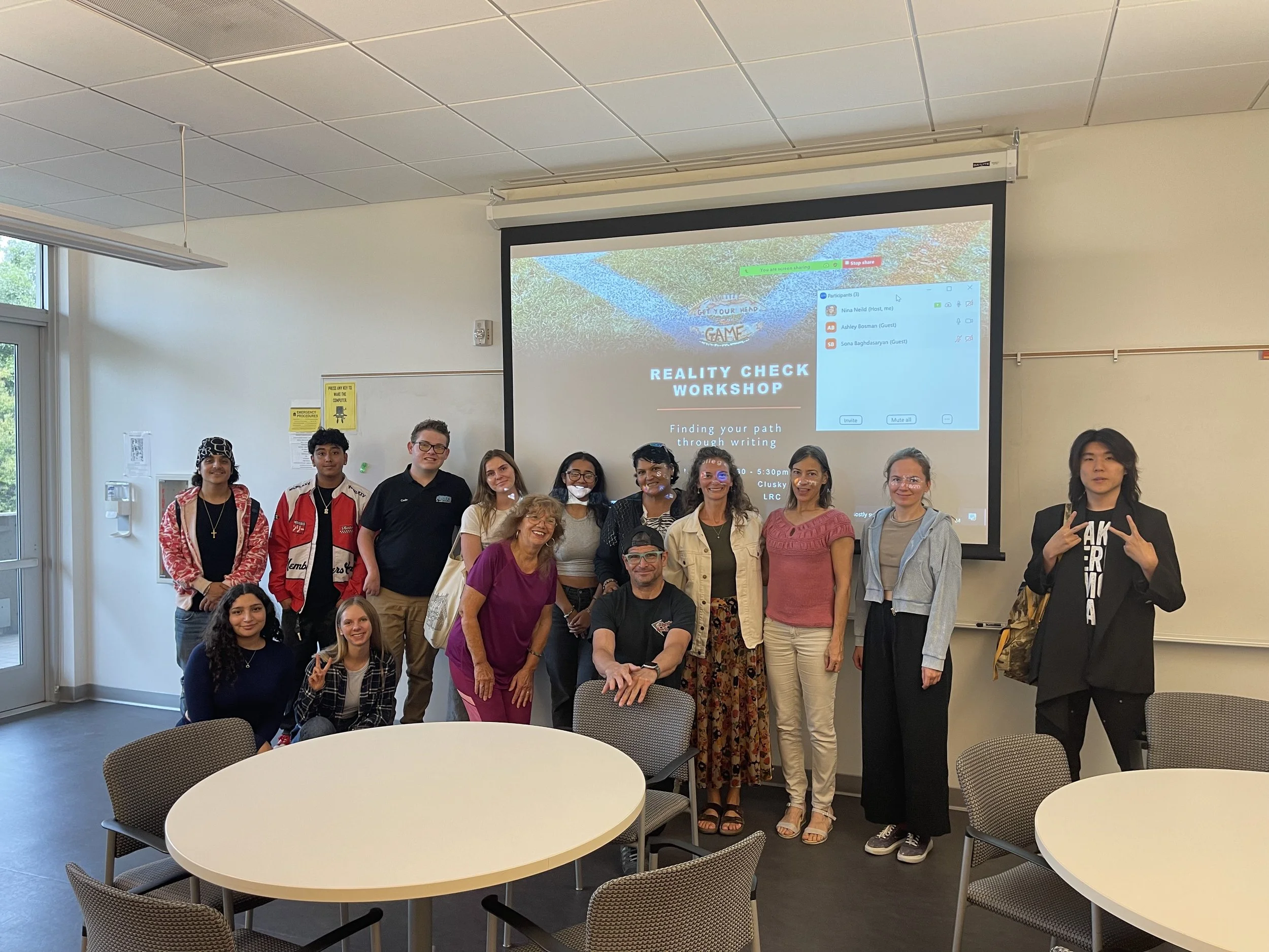
A group of in-person and online participants immersed themselves in an environment on September 18th, 2024 where we discussed what motivated and blocked their writing process and how writing could potentially help to re-align their path(s) in life. This football themed workshop was inspired by a young football enthusiast who attended my previous goal setting workshop and moved me with his realization about self-love.
I’m always inspired by those who attend the PLBTM workshops so it was no surprise that another football enthusiast, Cade Spinello, a first year Saddleback student, moved me during this Reality Check workshop with his incredible story. He shared how he overcame a brain tumor and stroke at five years old and how he’d become an inspiration for professional athletes across the nation. I felt so blessed to have Cade and his dad attend as they were a great resource to help me understand if my football and writing metaphor actually worked and it definitely did.
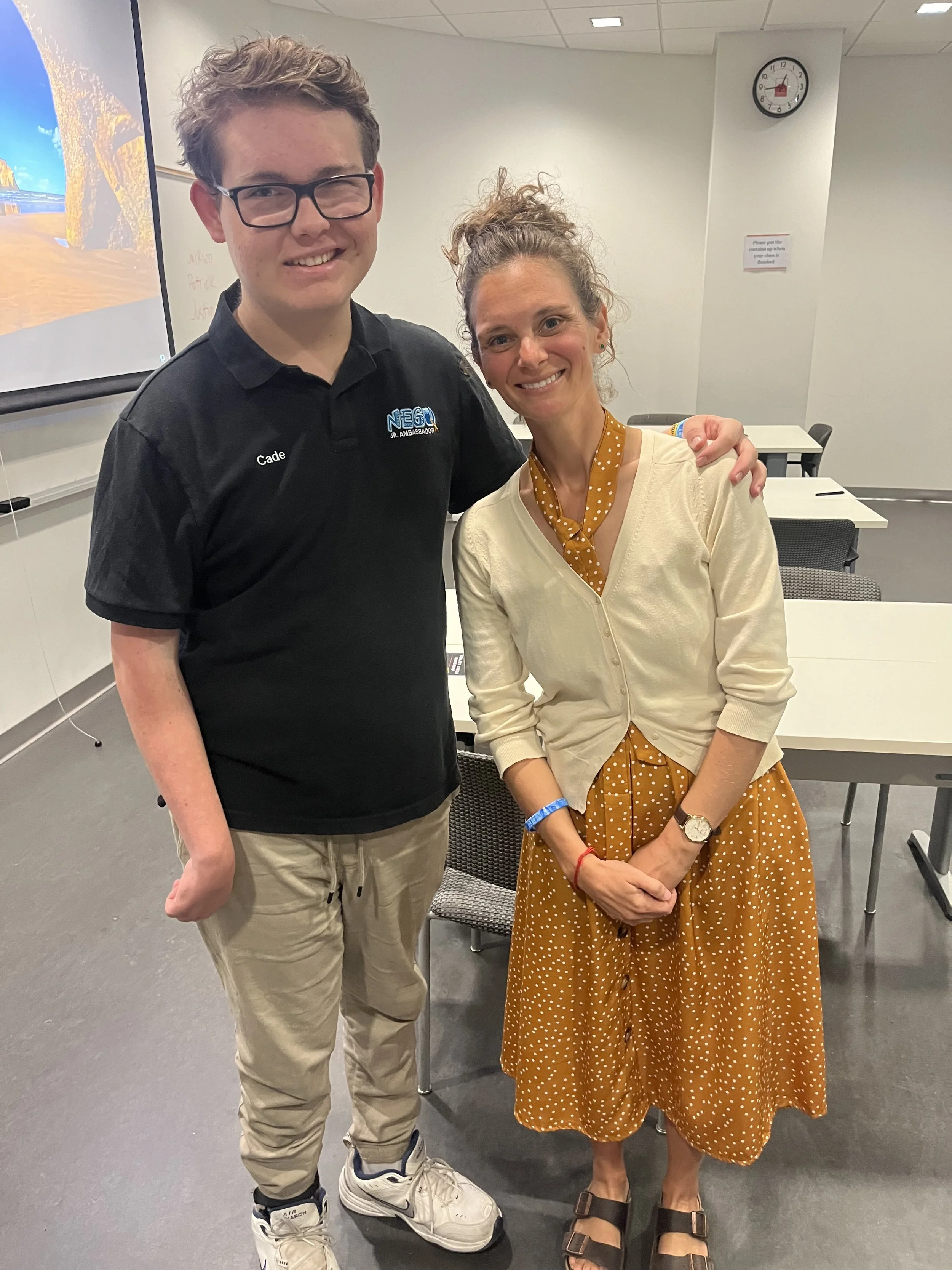
Cade Spinello & Myself
Curriculum
A booklet that walked the participants through the following:
Learning about themself & their writing process
Exploring their avenues of interests & how to use them to help with their writing
Gaining clarity on what motivates or blocks their writing process
Understanding the benefits of writing
TIMESTAMPS
00:16- 06:12 “From These Hands Grow Dates” by Waeli Wang
06:13-13:33 “Growing Up Feels Like A Dream” by Elizabeth Feist (Another performance I was in during this showcase)
18:51-24:24 “Family Business” by Lauren Schmid
CREDITS
Photography by Steve Rosa


I couldn’t be more pleased with the collaboration between the participants and myself along with the joint effort from Nate and I to create this program for them.
Interested in a workshop?
Related Products


2023-06-03: FTR Grand Opening
We always knew Nate had a business mindset because when he would be asked to cut the grass at a young age, he would find a friend in the neighborhood he could pay to do it for him.
Unfortunately, this business mindset took Nate down a dark path for a bit during his high school and early adult years, but he turned himself around and took the high road to becoming a physical therapist. From here he set out on finding a way to combine his knowledge of healthcare, personalized approach to helping patients, and his love for snowboarding and sports training.
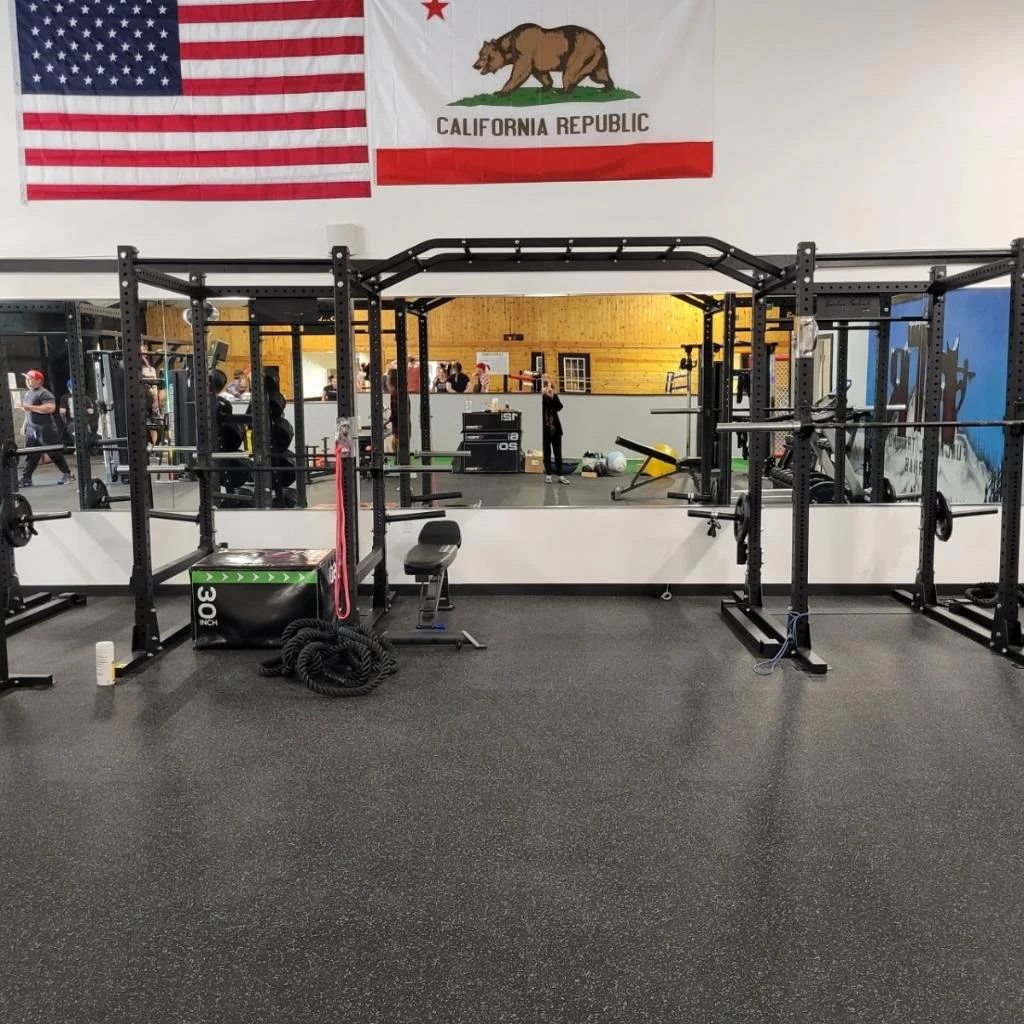
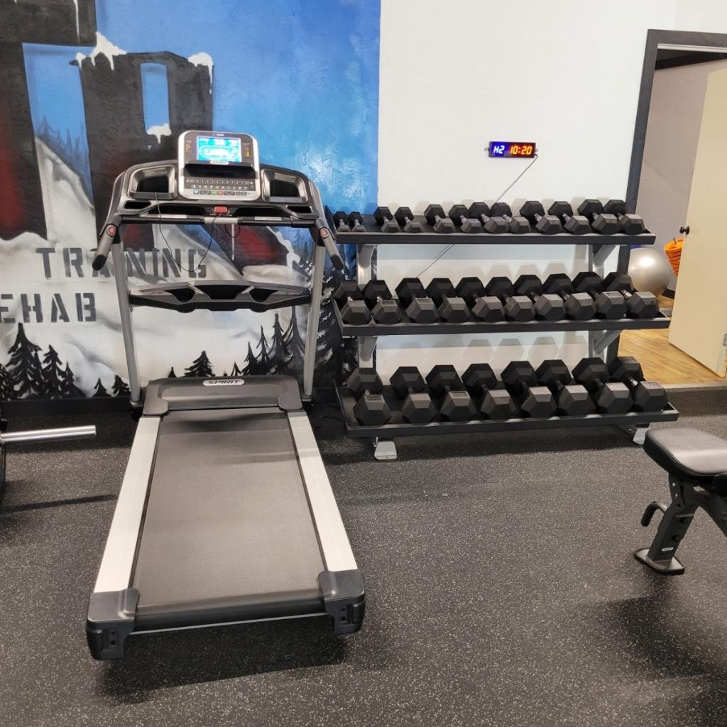
I’m stoked to tell you Nate figured it out and took an opportunity to rent a 2,500 square foot space in Big Bear, CA where he got the equipment and tables he needs to start doing what is called functional training and rehab.

What is FTR?
It’s a therapy program that helps to improve a person’s overall physical fitness and performance by training the body to perform movements that are relevant to daily activities or sports.
Check out FTR’s instagram @ftrphysiotherapy that shows many great videos on exercises and techniques Nate and team does with their patients.
The grand opening was shared with two other businesses, a gym called Fitness Source and a mixed martial arts place called Fight Syndicate, that are housed under one facility called High Altitude Training Center.
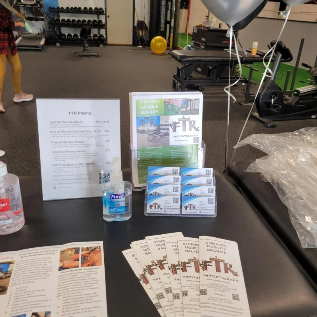
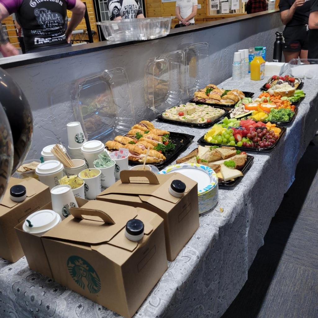
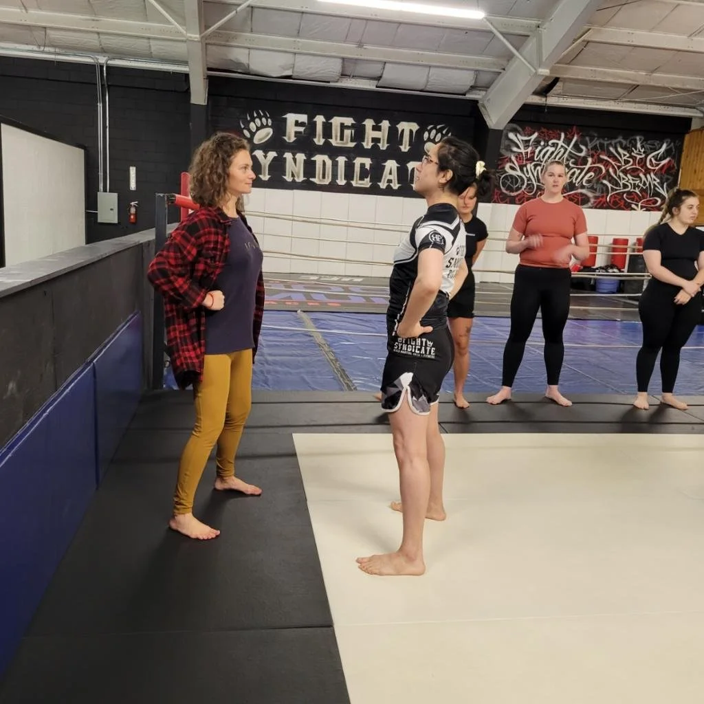

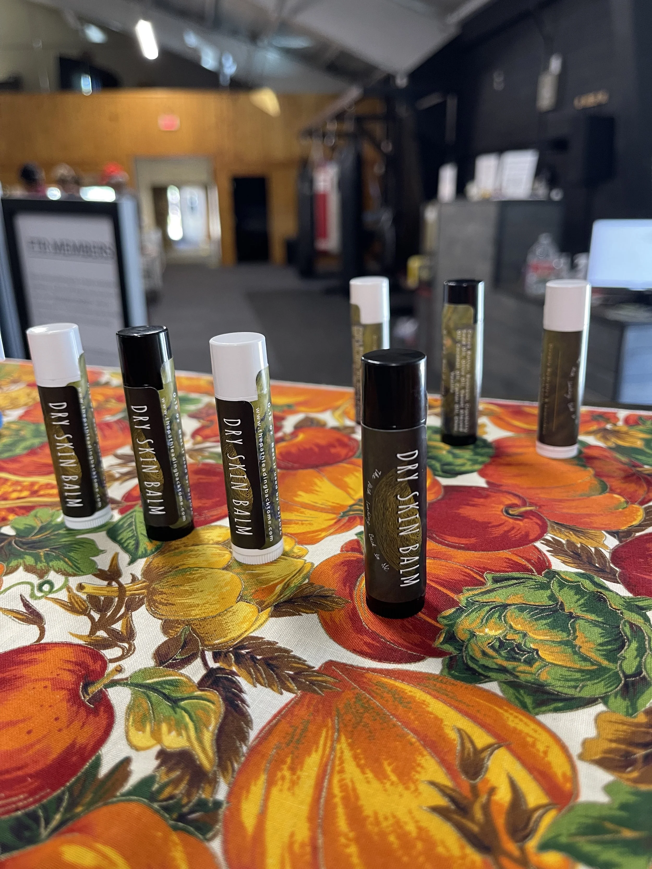
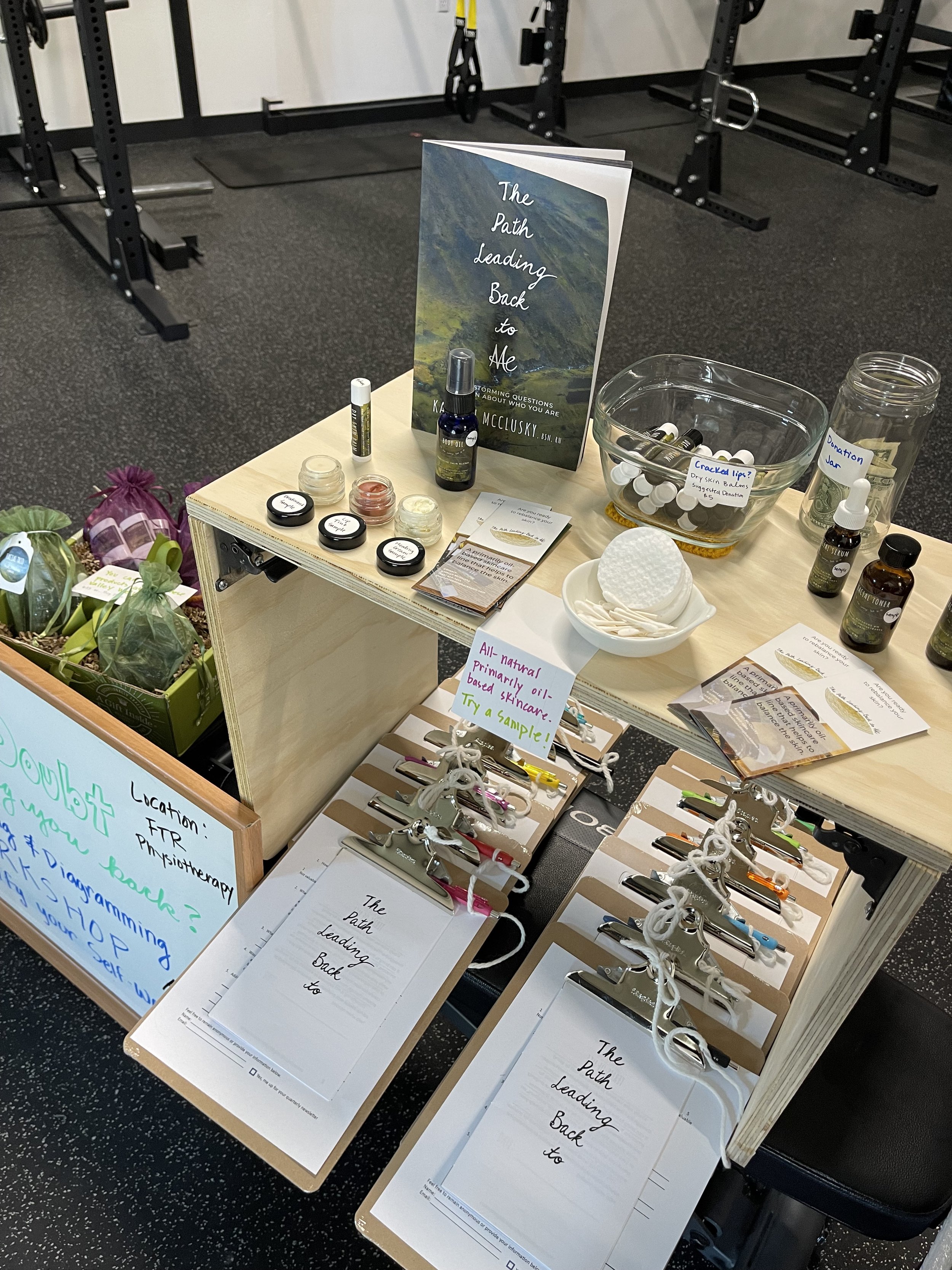
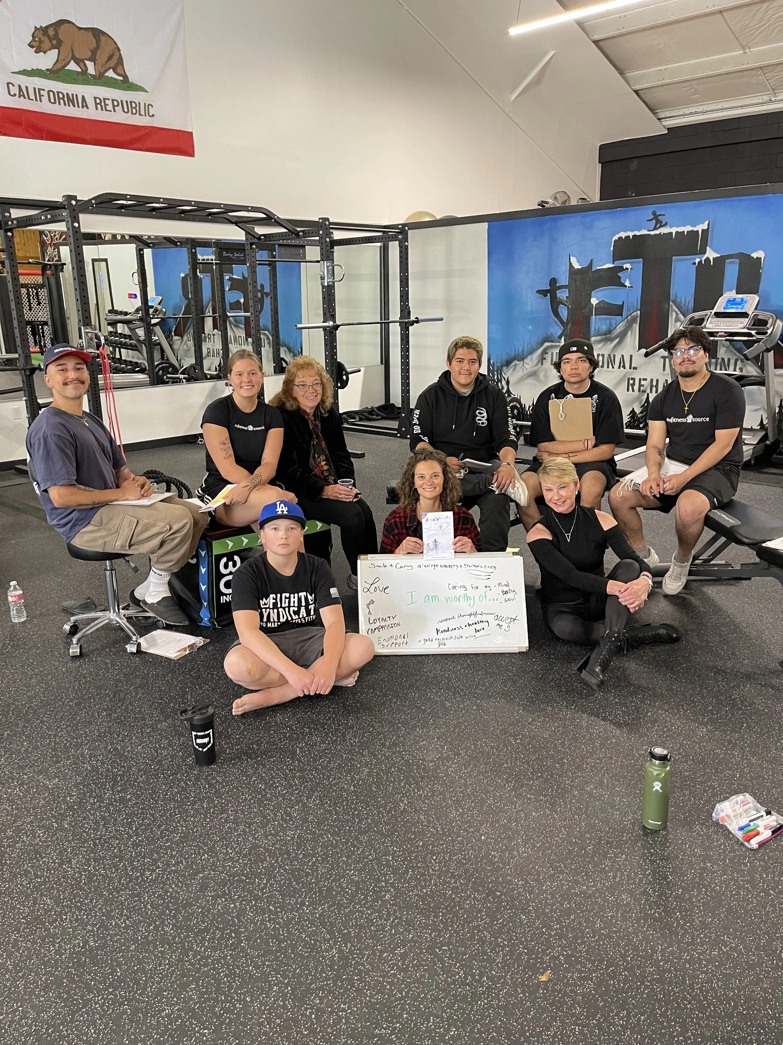
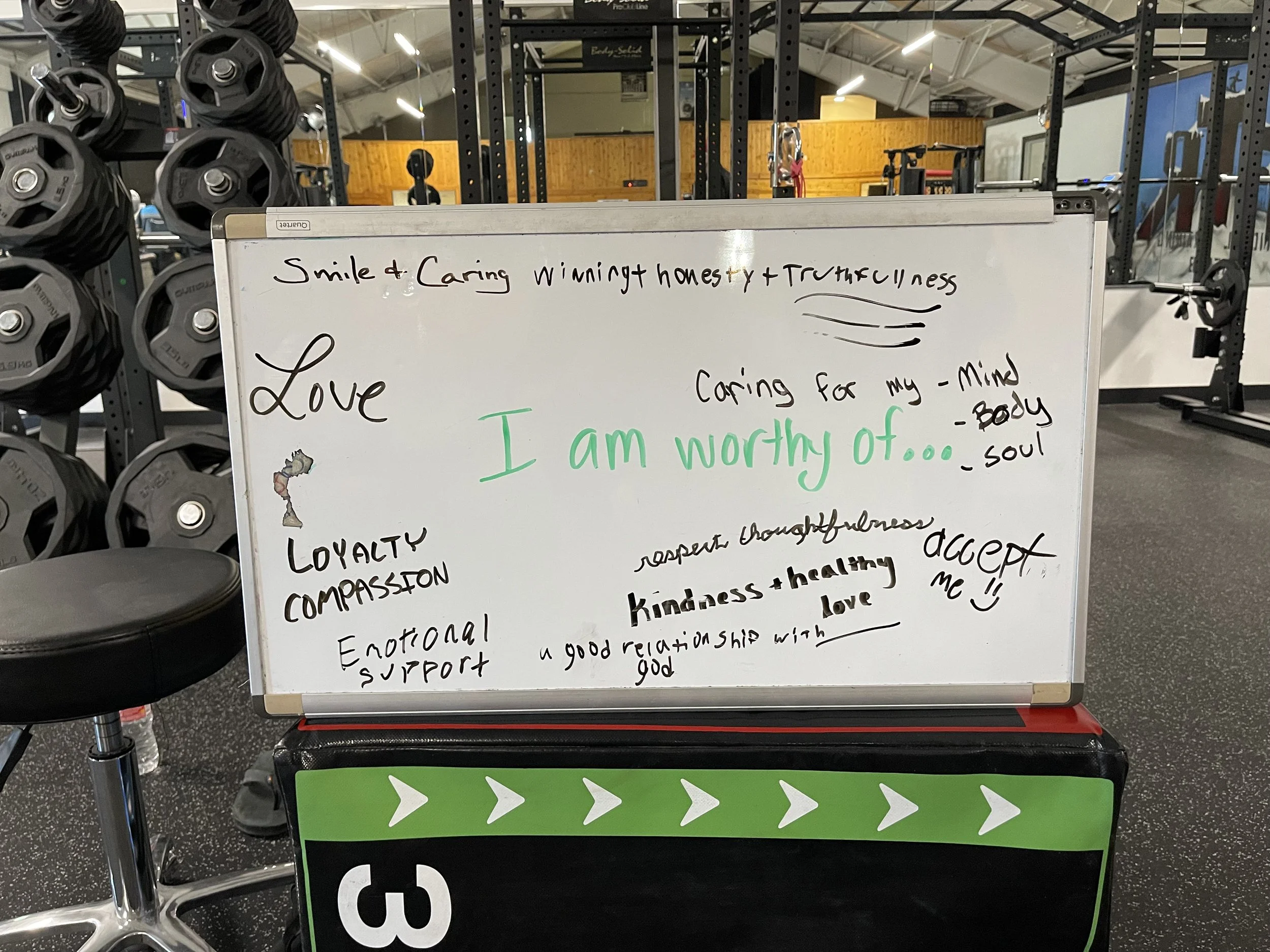
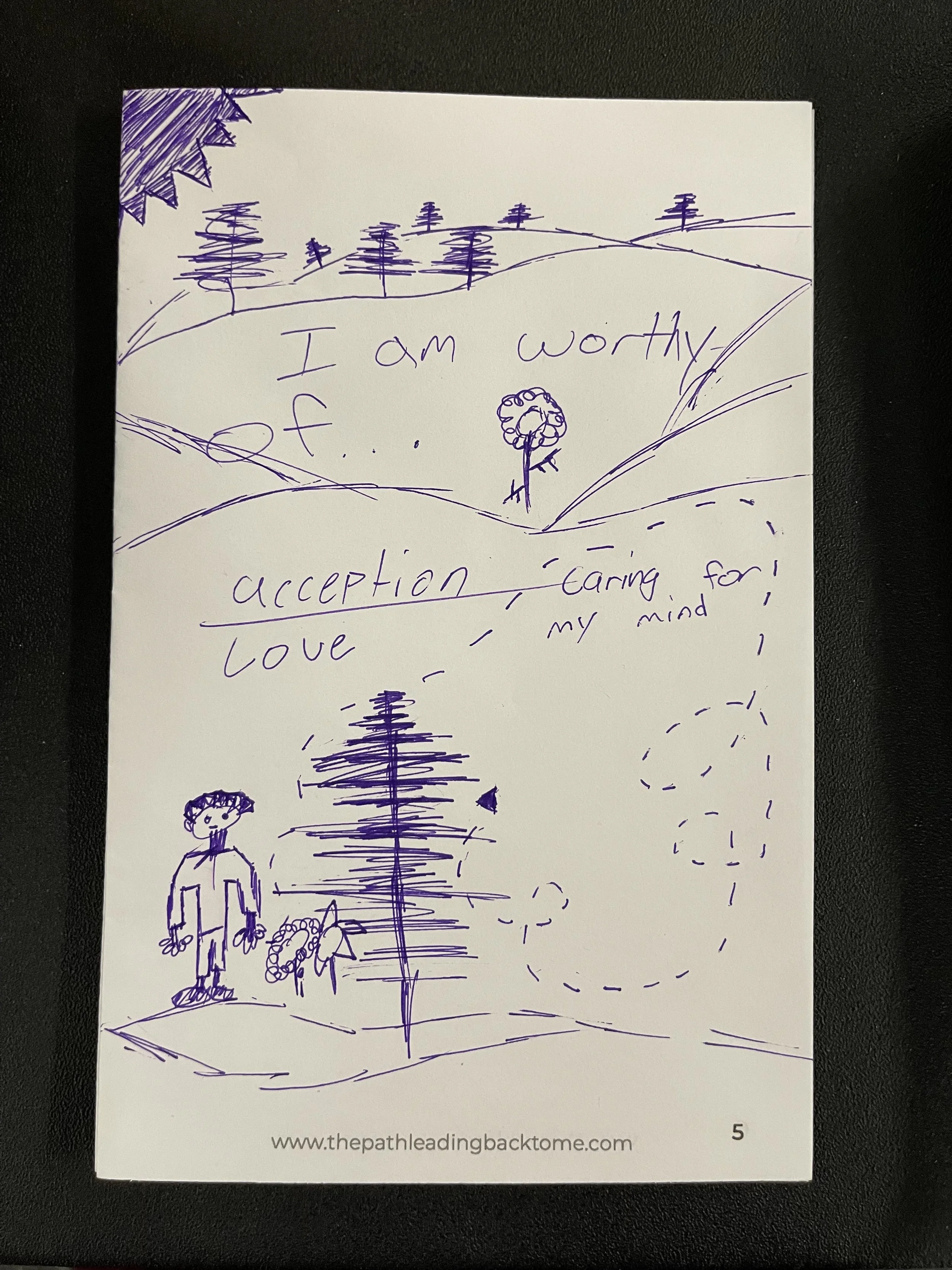
Nate and I were able to collaborate during his grand opening where he opened up his space for me to facilitate a “Self-Worth Workshop” and put out samples of my skincare line, which will now be sold at Bear Valley Wellness down the street. It was a great success!
Eight lovely people joined in where we had a brainstorming session to identify our self-worth, created diagrams to personalize this discussion, and touched upon how our self-dialogue impacts our thoughts of self-worth vs. self-doubt.
SELF-ESTEEM WORKSHOP
Identify how self-dialogue affects your feelings of self-worth and self-doubt, which then determines your level of self-esteem.
CURRICULUM
Initial Assessment
What is self-esteem?
How does self-worth and self-doubt affect self-esteem?
How does our self-dialogue play into our feelings of worthiness and doubt?
What influences our self-dialogue?
How does our level of self-esteem influence our decision-making process?
Nate’s vision for this space is really beautiful. He wants to invite others who are experts in their areas of yoga, meditation, stretching, nutrition, therapy etc. to use FTR Physiotherapy as a place to gather and help bring full body transformations for all the people who come there. Couldn’t be more happy for this guy!

Interested in a workshop?
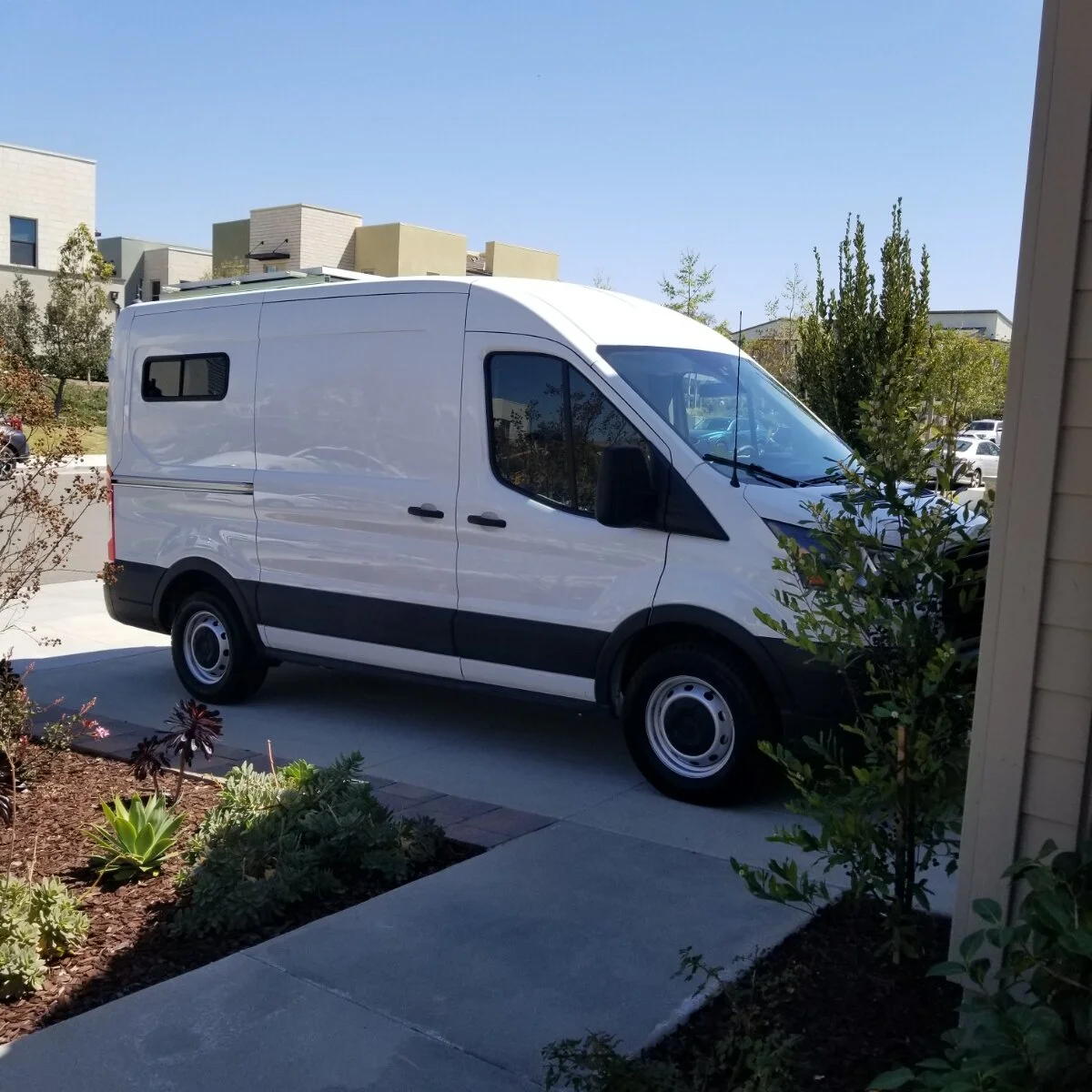
2021-09-11: "Stay Wild" Van Build
My brother, Nate tends to bring home interesting “gifts” that none of the family is expecting though apparently he thinks about them for quite some time beforehand just doesn’t tell anybody. Like when I was in high school and he brought home this yorkie and said we couldn’t get attached to the puppy because he
was planning on selling the little guy to someone else. Well you know that didn’t happen as planned and we learned many great life lessons from this playful dog.
Same thing happened when he brought this van over to my parent’s house with these ideas to do a custom build and live out of it. At the time we didn’t realize it was a big thing especially for sports enthusiasts to complete these amazing van builds and live on the road. But with anything Nate puts his mind too, we support him 110% and said let’s give it a go.

This all happened right as the COVID-19 lockdown was taking place. Nate, my dad, and I coincidentally were in the same place during these quiet months and it gave us the perfect opportunity to do a very fun project with the family. My dad, who grew up working alongside his father in a machine shop and later became an
aerospace engineer, was the brains behind the custom build. I simply used it as an apprenticeship to learn more about something I absolutely enjoyed doing. And my brother, well it allowed him to save time and money on the custom build being able to leverage two very willing enthusiasts to do a lot of the work with him. So let’s just say all the stars were aligned when they brought us together.
We thoroughly thought through the material selection process and decided to use aluminum for the framing because it was lighter than wood and we didn’t want anything heavy weighing the van down.

As we built over the next year, we immersed ourselves in this process of constructing with precision, strength, and the right materials. I learned all about a vernier and how to do fraction calculations that made my head spin! Don’t ask me to do it again because my mind will probably go blank. But what a very fun challenge it all was.

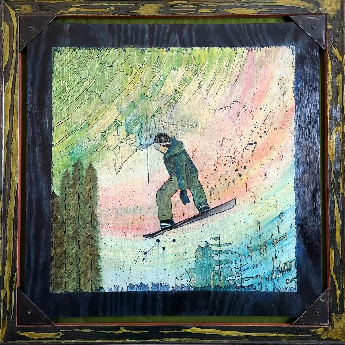
At the heart of this build was my brother. We wanted to make this van represent who he is and what he enjoys. So I started a mixed-media painting for Nate that was a replica of a picture taken of him snowboarding at Big Bear (same one that’s on his shirt in the header pic 😉).
We learned a lot from this van build, especially my brother. For one, after we added in this ceiling to provide greater insulation, Nate realized he probably should have gotten the taller van that was a bit more expensive so he could more comfortably walk around. Then after adding in the bed, he thought how it might have been better to have something that

folded up like a Murphy style bed or one that lifted to the ceiling so he could utilize the space in the back for more purposes.
It was good these learnings happened beforehand because half way into the project, Nate got into a bad snowboarding accident that left him with 9 broken bones and a collapsed lung.
It’s interesting how our outside worlds tend to symbolize what’s going on with our inner worlds because shortly after his van also got into an accident of its own.
With both of these occurrences and two offers that came in on the van, Nate had a little heart to heart with himself during the 3 month healing process. He came to the conclusion that it was best to let the van go and try again with one that would be more suitable to his living style sometime in the future.
This was a very wise move and one that happened when we renovated the Texas farmhouse. See we have to go through these test phases to know if something like “van living” or building a center out in the country is really the thing for us or not.
For Nate, he learned it was with a few modifications of course. For me, I learned I prefer a full, functioning, spacious bathroom with a flushable toilet. The pull out from under your bed, compost toilet doesn’t do it for me. But just because it’s not to my liking doesn’t mean that if the opportunity was presented to me, I’d shy away from it. In fact, I’d probably give it a go because what a crazy, cool experience.
With that, I take my hat off to all those who are living the incredible van life. Go adventure the world and I can’t wait til we get to custom build Nate’s future van when the stars align yet again.
Final Pictures


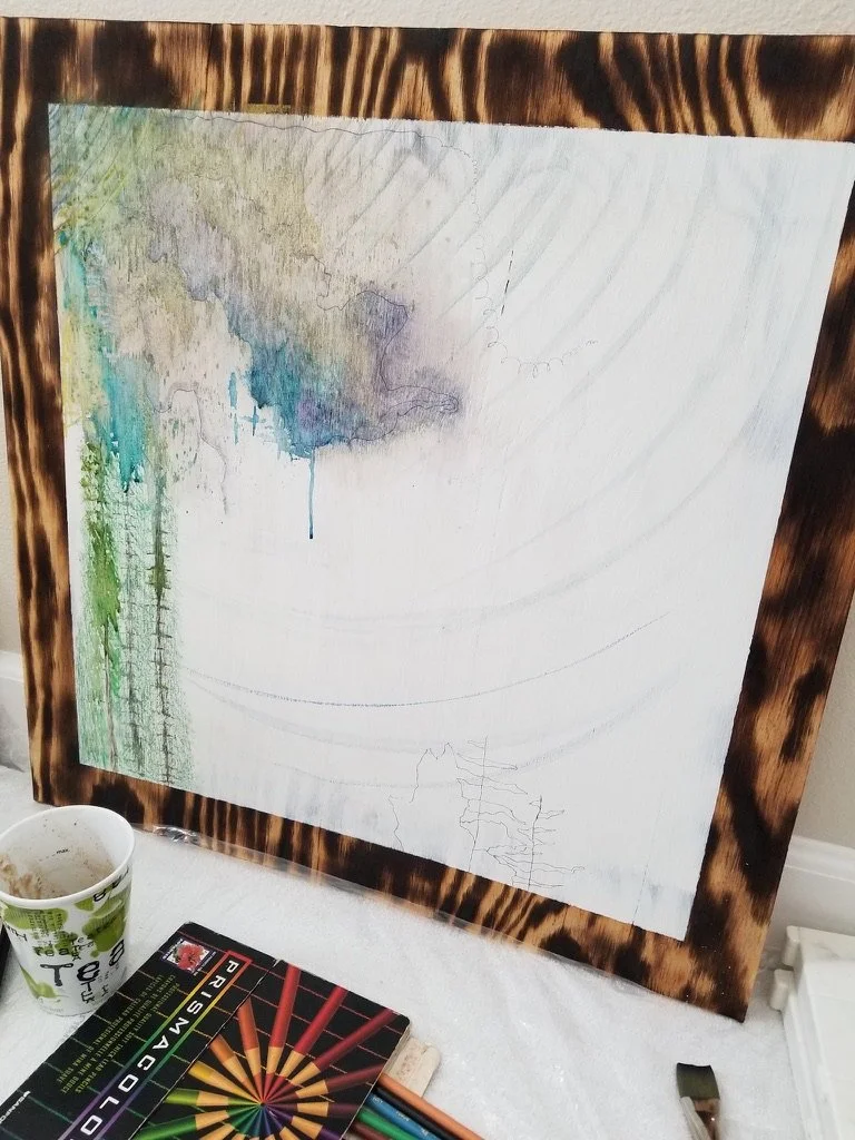
2021-08-15: "Stay Wild" Artwork
During my high school and college years, it was very rare that my family received a picture of my brother with any inkling of a smile on his face. He always looked a disinterested in the ones we did receive and well we started to wonder if he was ever going to find his spark. It’s hard to know when these great interests of ours are going to be rediscovered, but the day my family saw a photo of my brother flying through the air on his snowboard, which was printed in a newsletter for the mountain resort he worked at, we knew that spark had been found. Most of Nate’s face was covered by his helmet and goggles and there was no smile as usual, but instead was this sense of contentment emitting from his being. He’d found that inherent enjoyment he had been searching for and it was wonderful to see.
I had this picture printed on the back of a t-shirt the following Christmas. Nate wore this shirt all the time and I think was quite proud of it. So when he decided to do a custom van build, I wanted to personalize it even further with a painting of this very picture.
Since we were constantly at Home Depot purchasing supplies, I decided to pick up a piece of plywood and char the edges to frame out the picture nicely.


From here, I added in the layered background consisting first of watercolor, then acrylic, followed my markers and sharpie.
Progress Photos
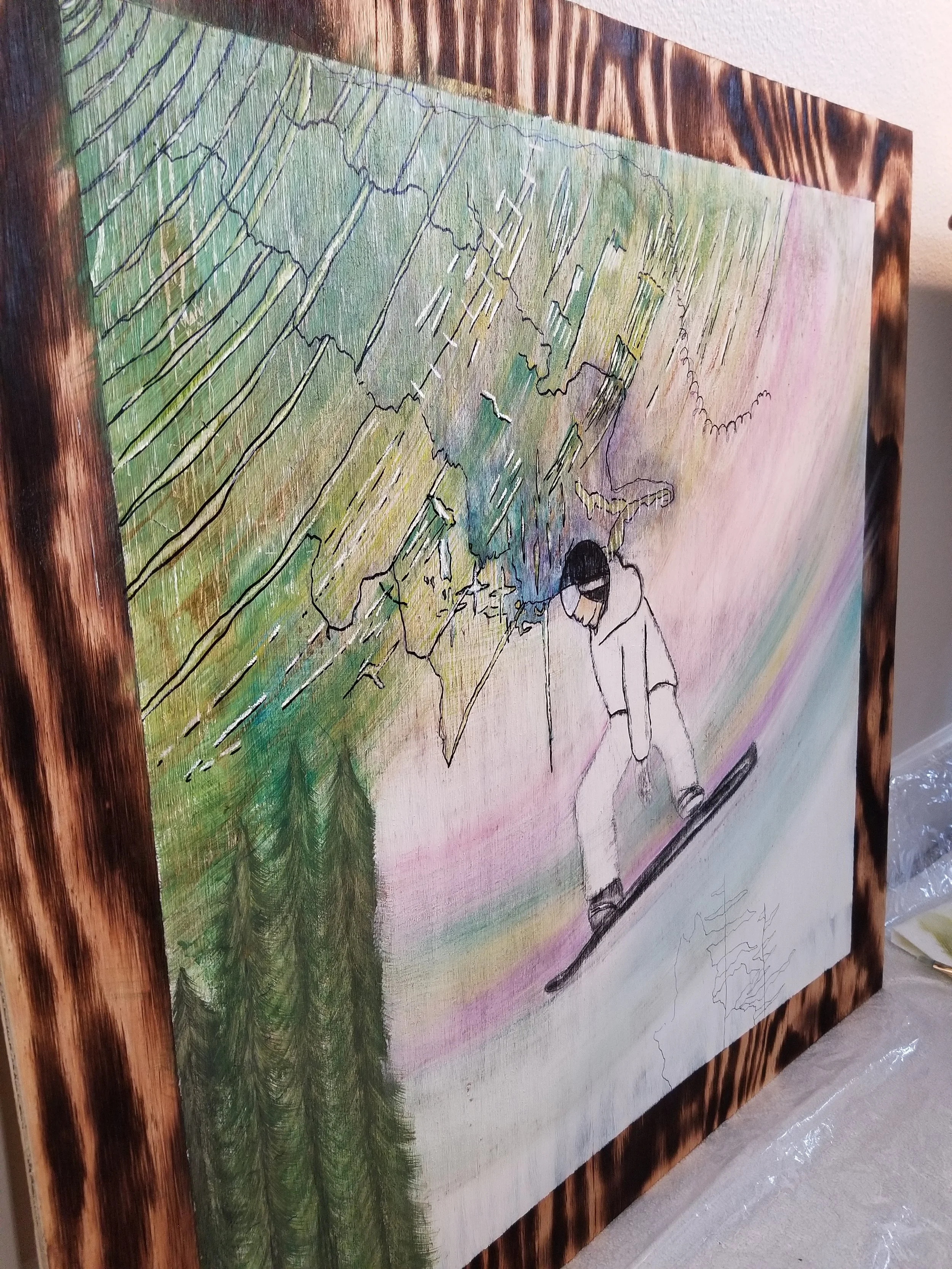


Nate had been wearing this shirt that said “Stay Wild” and I happened to be reading Cheryl Stray’s book, “Wild” at the same time so I took it as a confirmation that a saying along these lines was going to need to go in the painting.
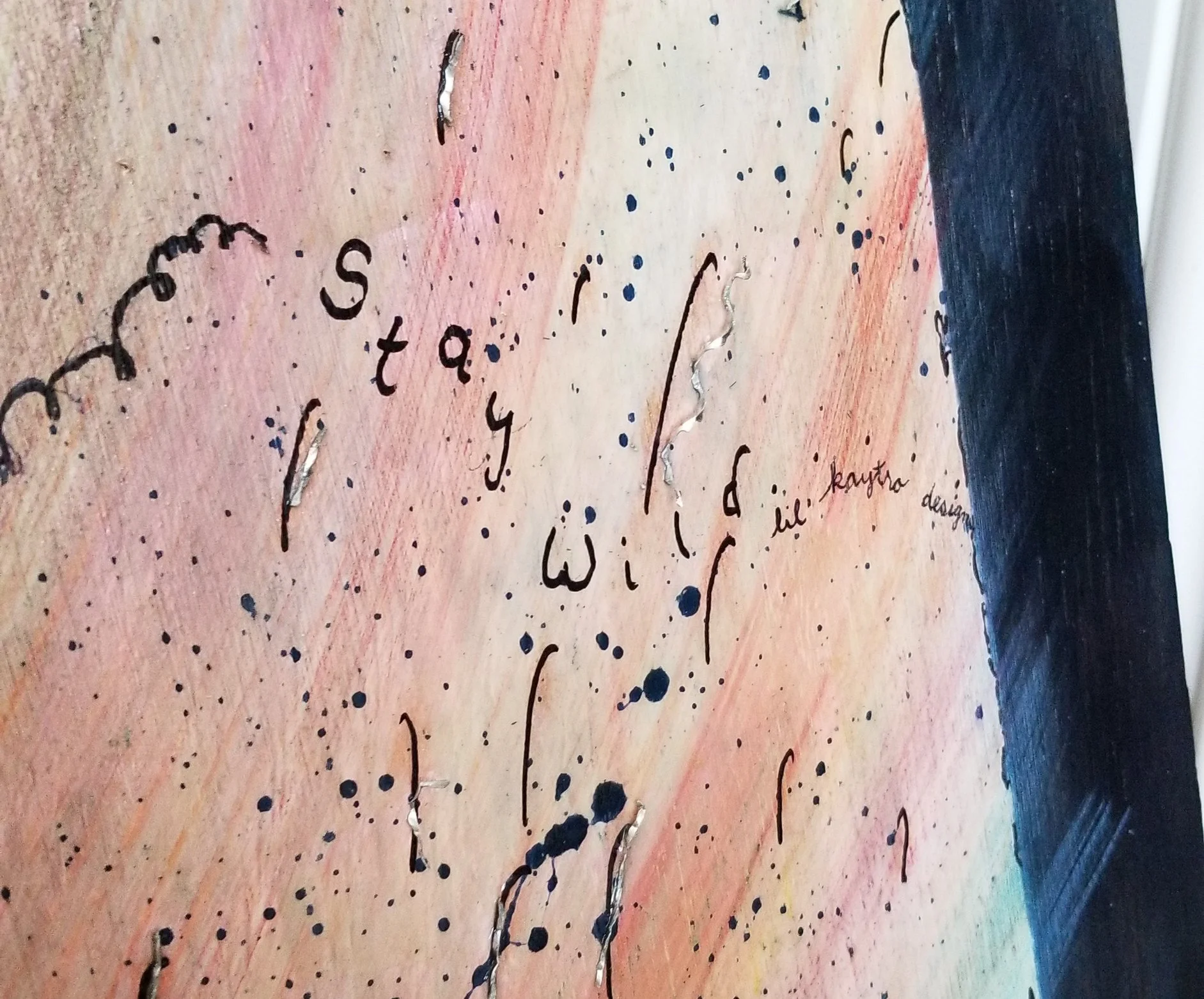
At the time, we were putting up the framing and plywood in the van, and every time we drilled into the aluminum, we get these curly “q” shavings that were a must for this artwork. They were going to resemble the snow floating up into the air as Nate took his jump perfectly. It was also going to symbolize the foundation in the van that you couldn’t see, but was holding up the walls with a lightness and strength just like Nate looked in the painting.
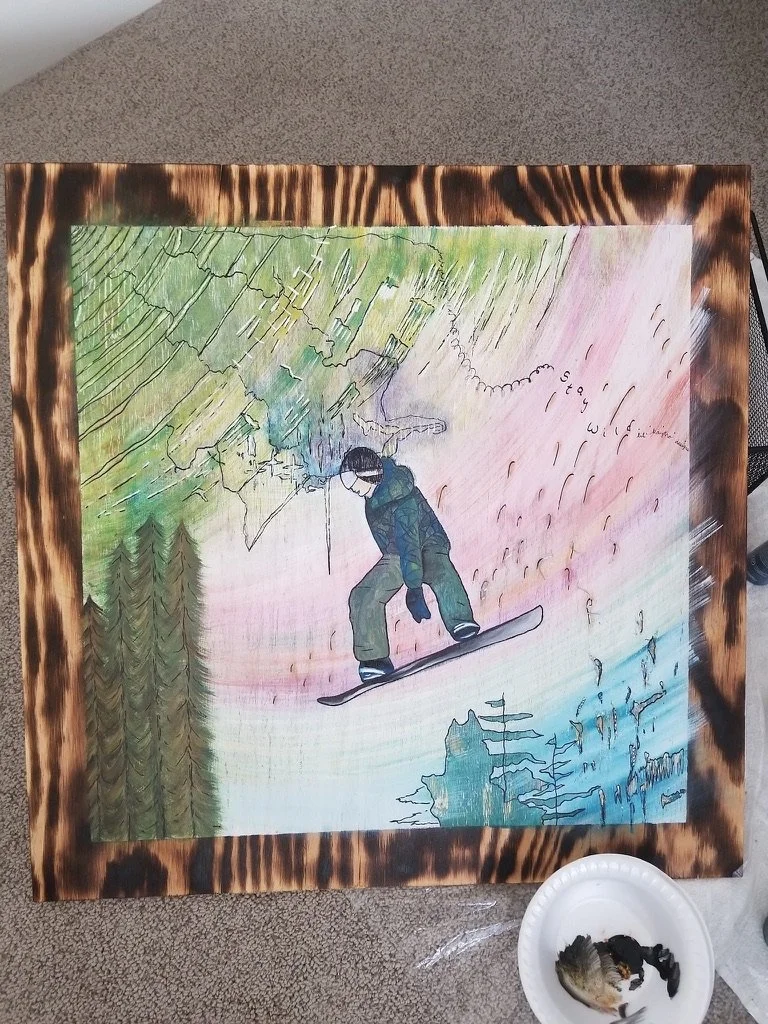
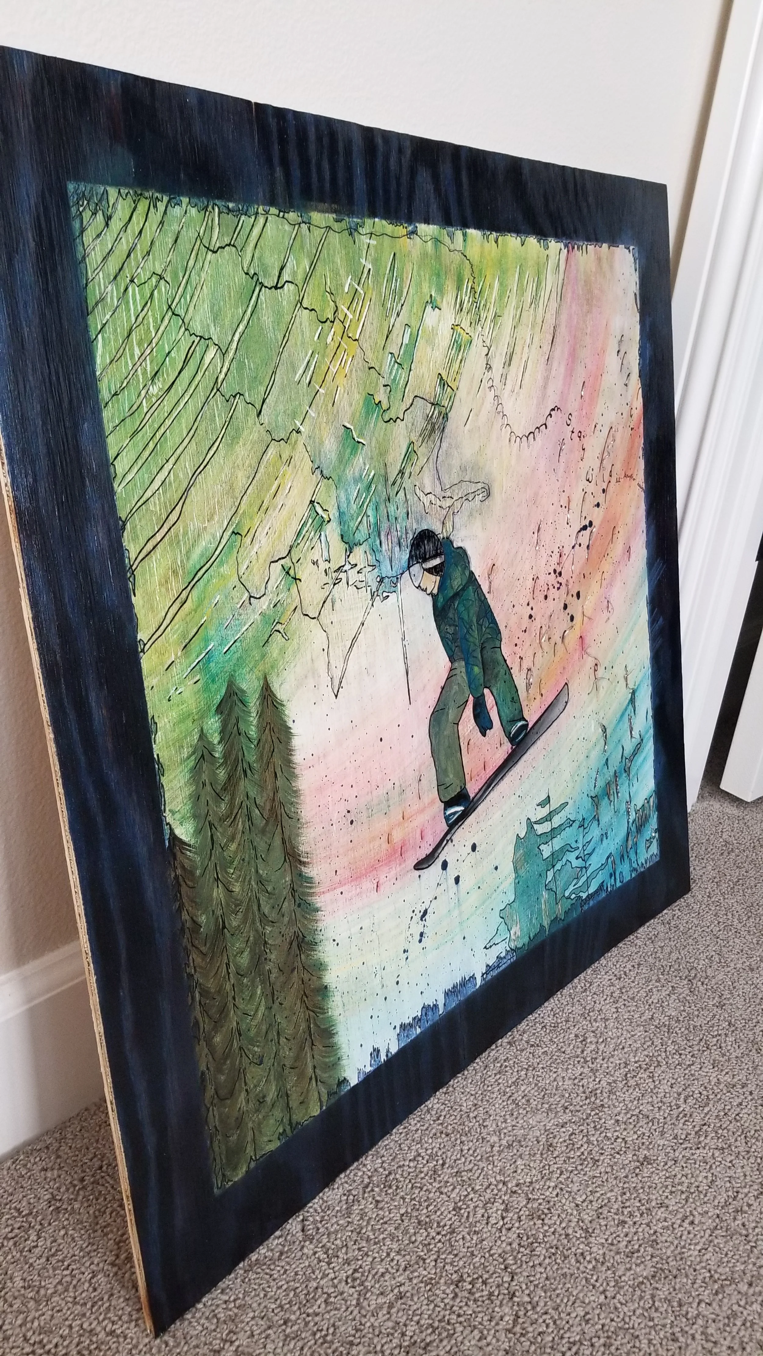
After the artwork was finished, we needed a unique frame to give it a little more dimension. My dad helped me come up with this design out of about $14 worth of materials. This was far better than the $300+ charge a custom frame was going to cost us. I used a blue and reddish stain, sharpie, and a green powder that was sealed with polyurethane.
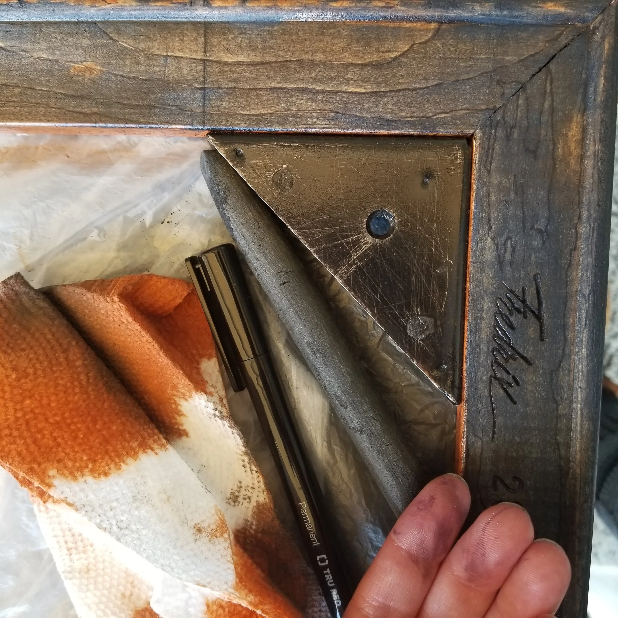
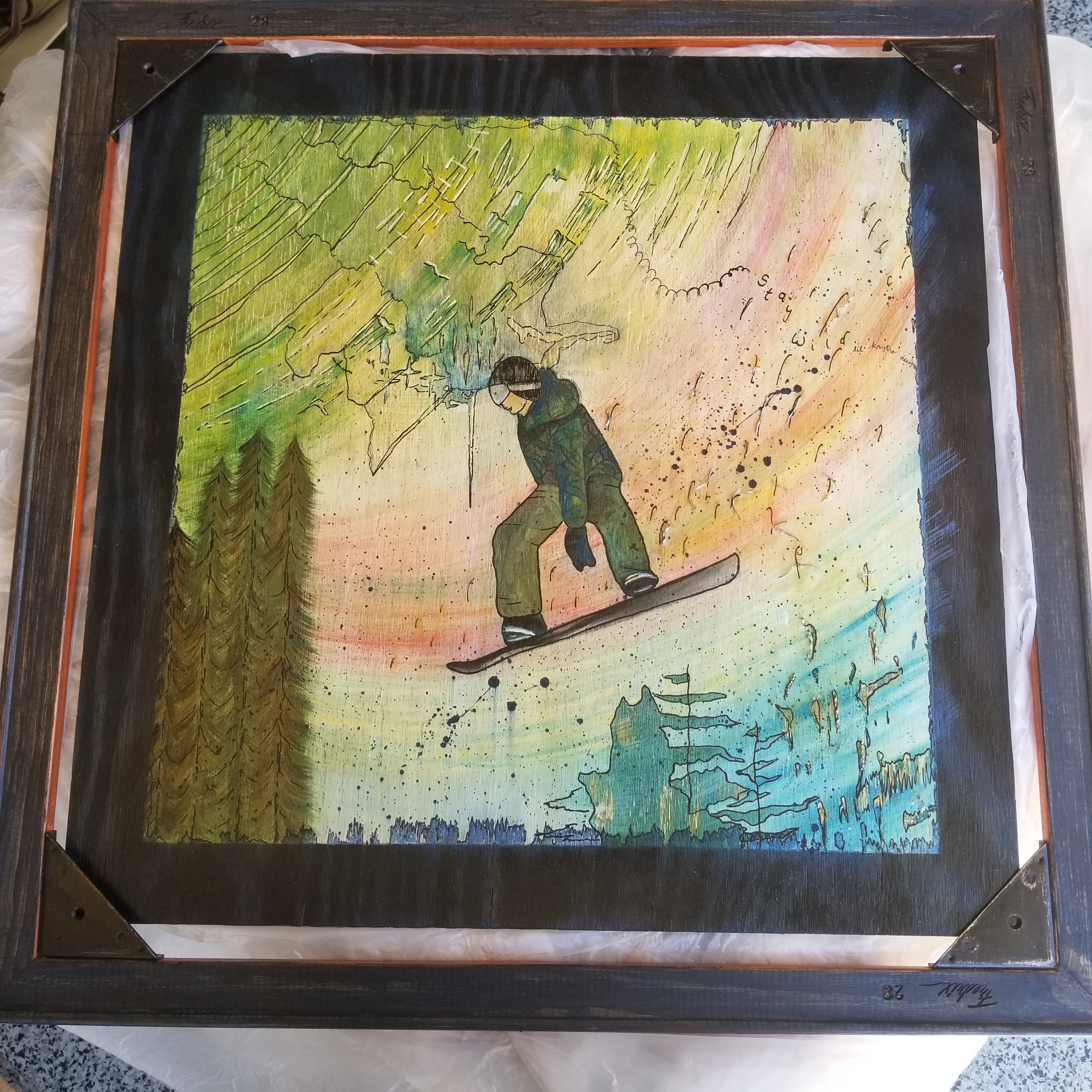

To finish it up, my mom wanted to add her special touch and sewed a forest green cloth we put on the back with a thin piece of decorative aluminum. If you actually put the painting up against a window, you can see the cool design in the aluminum showing through the green cloth giving it an even more uniqueness.
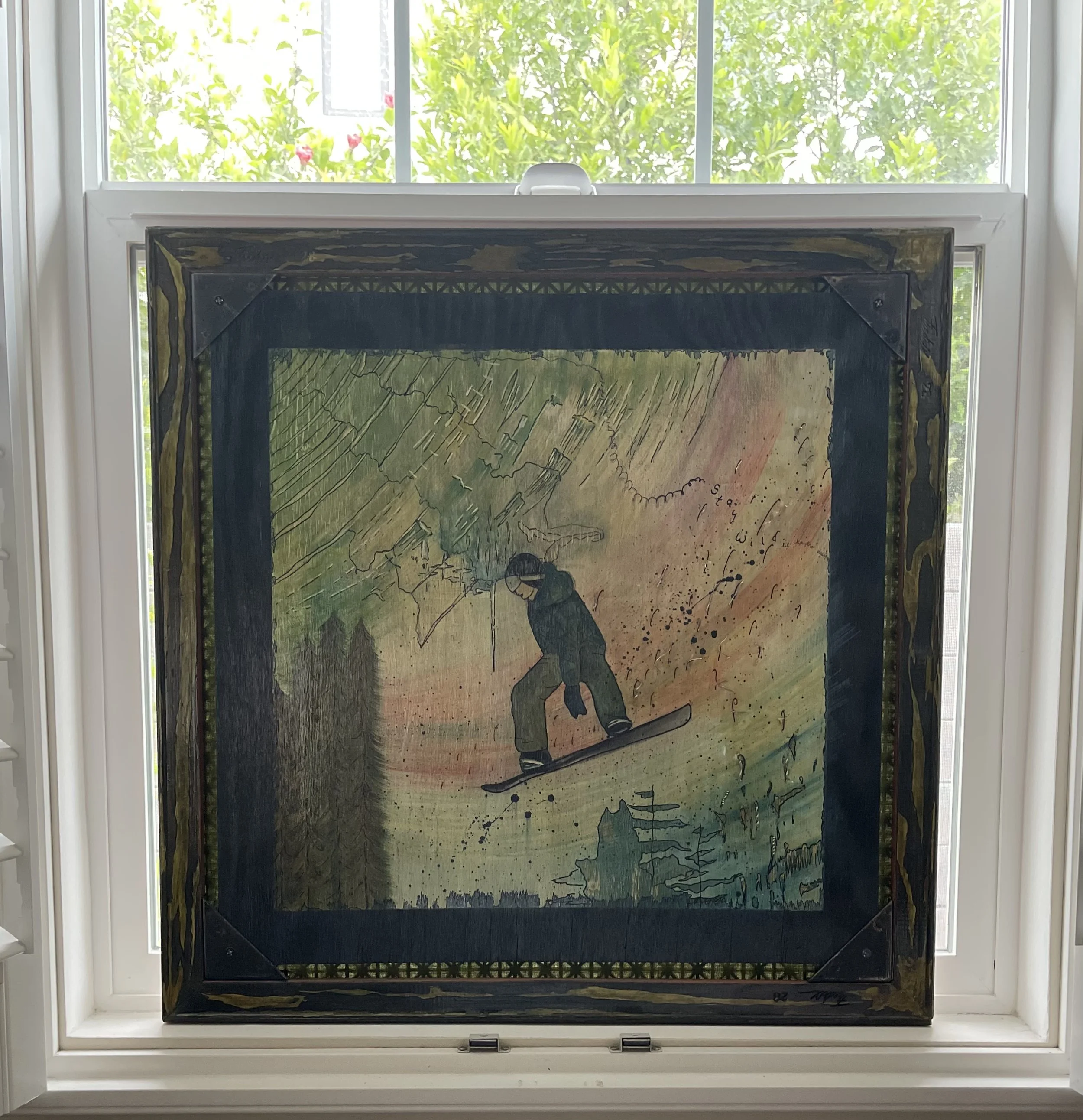
All in all, it was super fun and took almost a year to complete.
This project was actually a game changer for me. It helped me see my life’s purpose to collaborate with people of different ages in finding, rediscovering and / or enhancing their interests and God-given talents to help them find their way back home through LOVE using writing.
Related Products


2021-01-01: Simplicity Workshop

Journals
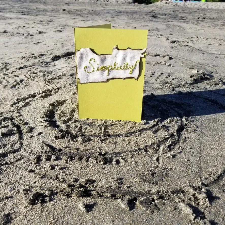
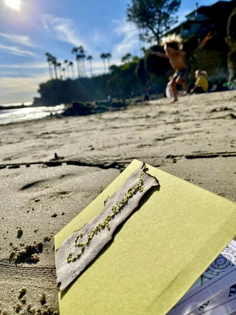
Words send out powerful vibrations into the ether. These vibrations can create beautiful, harmonious changes. Every year I try to think of a new word for myself. Something I know I need more of to bring greater harmony into my life.
In 2019, I remember my word was laughter and boy did I notice how many
conversations with family and friends would have me laughing so hard my cheeks would hurt. This year my word became simplicity and I mentioned this to Denise who said, “me too me too!”
I knew this was my word because of how complex I felt everything had become after the interesting year of 2020 came to a close. But my intention behind the word wasn’t to denote laziness. It was to make everything I do more purposeful and efficient so life ultimately became more simple.
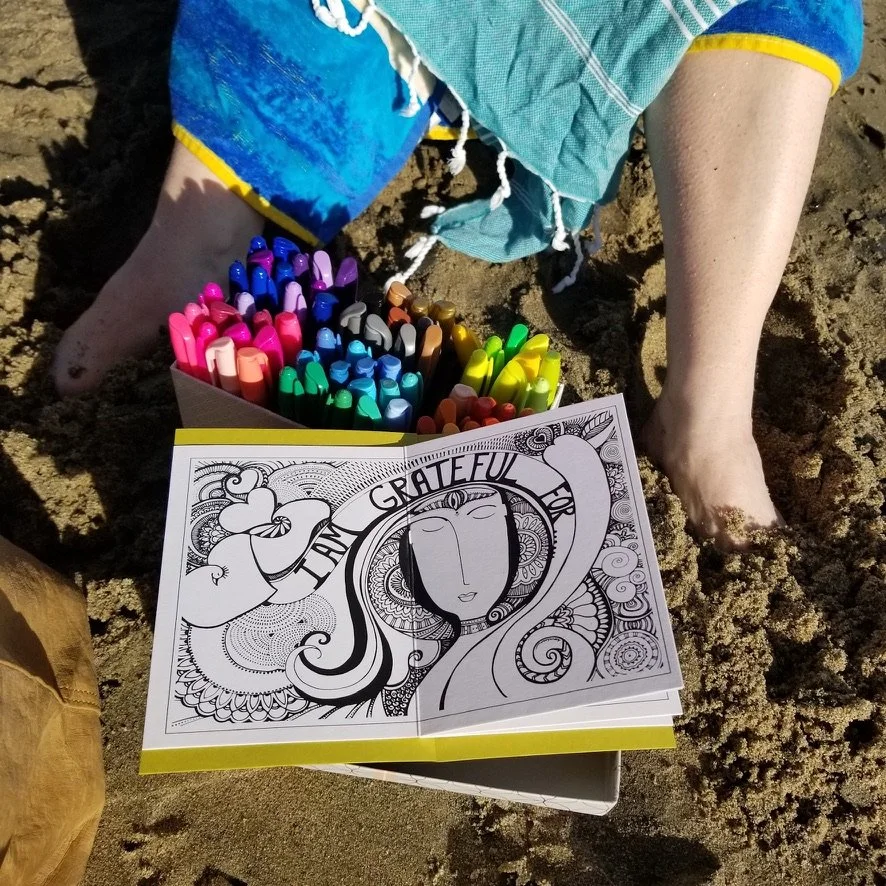
I created two lil’ journals with simplicity embroidered on the front for Denise and I so we could really bring traction to the word. Then I printed the three very effective illustrations Loveleen S. created to set your intentions for the new year and put them in the journals (pictured above).
Denise asked if we could do the workshop down in Laguna Beach, CA so we gathered our supplies and headed that way on New Year’s Day. I walked her through the three illustrations…
“I am grateful for…”
"I am ready to let go of…”
“This is my year of…”
It always surprises me to see what shows up emotionally when you go through these activities. For me, I started out making everything look all pretty and colorful using the abundance of sharpie markers I packed for us, but by the end I was down to scribbling with a turquoise color while feeling a great amount of resistance show up with each stroke. For Denise, it was much different and her own personal experience that helped to clear the way for a new beginning to the year.
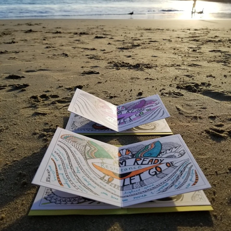

The best part about this workshop happened at the end. We noticed a little boy designing a labrinyth in the sand with a stick and digging out a ditch so he could run and jump into it. His laughter, smile, and playful heart won us over. The simplicity of a child playing without a care in the world was the perfect representation of our word for the year for us to remember.
When you set these intentions, they become magnets for those words to manifest in your life. In the following months, everything did begin to shift, especially for me. Not only in my personal life, but in my work adventures, building projects, and day to day activities. Denise felt the same. It was a real gift and one I hope everyone gets to experience.
2020-05-28: Creating A Lip Balm Formula
Denise has highly allergic and sensitive skin. She’d been using the Urika Dry Skin Balm and loved it, but was a little nervous about the nut oils in our formula. Therefore, Denise reached out and asked if we’d be willing to help her develop her own formula without the nut oils and also add ingredients to increase the SPF. She’d always been interested in learning how to formulate her own balm and this was a great opportunity to fulfill this desire and personalize her skincare even more. So we told her we’d be happy to help.
How did we do this?
First, we created a base formula. This formula gave Denise the freedom to pick out the ingredients that best worked for her so she could apply them to the formula to create her very own concoction. Then I facilitated the creation of these lip balms by walking her through the necessary steps.
I sprung our zoom meeting on Denise after knowing she had all the ingredients. I did this on purpose because instead of her rigidly following a set of instructions we’d reviewed well beforehand, I wanted the process to happen naturally.
Watch the video to hear our session
During this process, Denise felt she needed to restart because she thought some water had gotten into the beeswax she was melting. Then Denise took the risk of putting in some zinc oxide into her formula without either of us ever trying it before. This was her trusting the process. I simply boosted her confidence to give it all a go.
In the end, this is what Denise said about the facilitation process…
I had been wanting to make my own lip balm for quite some time and was lacking the know how and confidence to do so on my own. Kathryn gave me the gentle nudge I needed to start. She expertly facilitated the process from start to finish and helped me see that I could do it. Her kind and supportive instruction allowed me to feel comfortable to experiment with the base formula, to create my own variation with zinc oxide, for product with a natural SPF. I'm loving my lip balms and highly recommend collaborating with Kathryn. She is a gem! – Denise M., California, USA
2020-01-20: Surprise Art Retreat
With a week long trip planned to Hawaii, Denise gave me the keys to her apartment and told me to come stay while she was away for some much needed peace and quiet. I was pleasantly surprised when I got there and saw all the art supplies set up in her computer room with Cheryl Stayed’s book “wild” ready and waiting for me to read it.

What I love about helping others on their PLBTM journey is I not only assist in supporting them, but they return that same support a hundredfold as you can clearly see here. So I texted Denise and she replied telling me to use whatever I would like for a mini art retreat throughout the week’s stay.
This whole thing actually hit me by surprise because I thought back to the last time I’d actually painted like this. It had been 10 years! Way back when I was wanting to go into graphic design, but switch to healthcare because I didn’t feel confident enough to do what I loved.
Denise must have intuitively known I was ready to get back at it. I took the canvas and had a little heart to heart with myself saying that whatever was going to show up was what needed to come through.
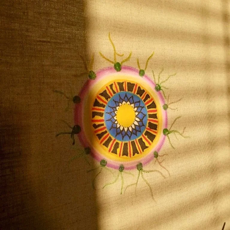
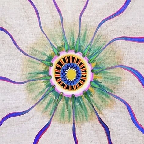
Pictured left is how it started and every morning I’d wake up with the
sun shining on what looked like an eye with veins and arteries coming off of it.
I’d continue to add to it as I felt drawn to the piece over the coming week sending pictures to Denise throughout letting her know I was using her art supplies to the fullest. It made her very happy.
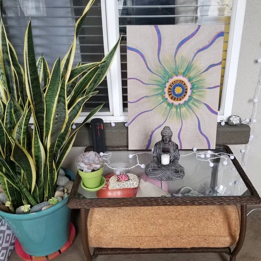
As I finished up the piece and introspected, I remembered how the eye is the window to the soul. A beautiful reminder that each one of us has goodness within ourselves and our eyes can reflect this purity helping others to see past the built-up, imperfect layers.
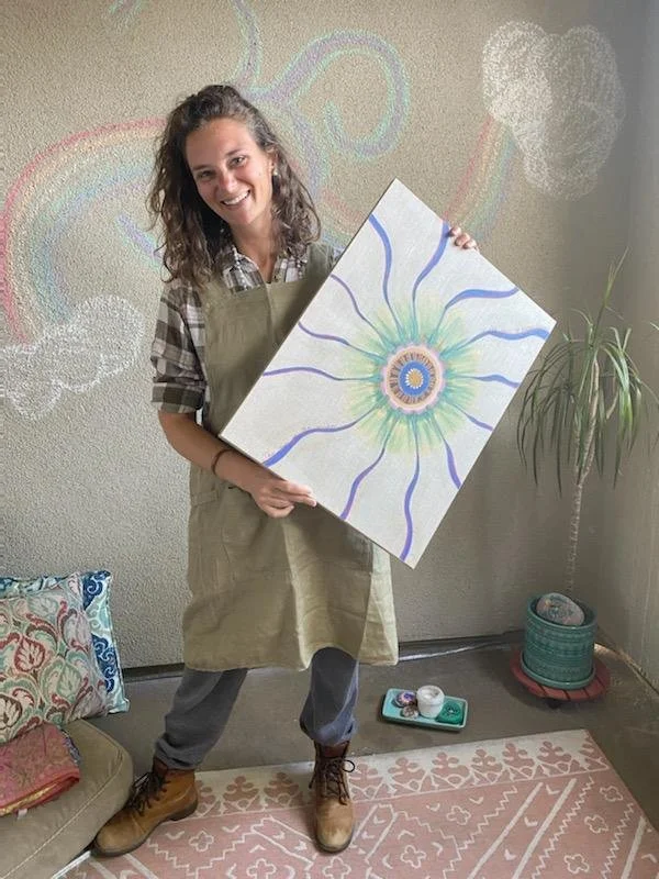
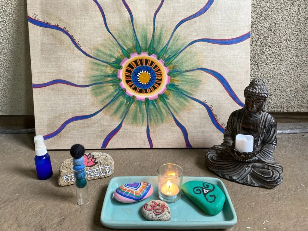
I decided to leave the painting in Denise’s computer room with the words “The eye is the window to the soul” written along one of the veins. It was meant for me to create, but it was meant for Denise to have. When she got home, Denise couldn’t believe I was going to give it to her and found a perfect home for it in her succulent, meditation garden.
I didn’t end up reading “wild” until a few months after. Some books are harder than others to get through and this one touched a little too close to home at that time. So it took a while to get the courage to read this incredible story, but I did eventually finish it. Oh and I’m pretty sure this artwork is going to become an inlay for a workbench / crafts table / dining table of sorts one day for Denise. Let’s see what ends up happening. Time will tell…
In Progress & Final Photos


“Your poignant story about the LA fires and your mom's cancer treatment moved me to tears. I just wanted to tell you that your story touched me, and I hope God blesses your family with abundant health and prosperity.”
- S.O. USA